When you struggle to read, it’s not always about effort—it’s about design. dyslexia-friendly fonts, special typefaces designed to reduce letter confusion and visual stress for people with dyslexia. Also known as readability-optimized fonts, they’re not just a nice-to-have—they’re a necessary tool for fair access to information. Many people with dyslexia see letters flip, blur, or jump around on the page. A well-designed font can stop that before it starts.
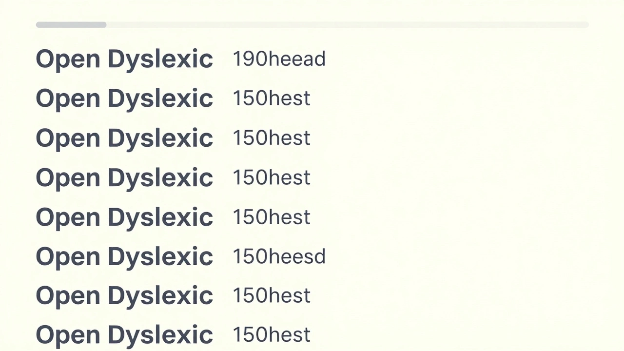
These fonts aren’t magic, but they’re built with clear rules: heavier bottom lines on letters like ‘b’ and ‘d’ to stop them from flipping, wider spacing between letters and words to prevent crowding, and unique shapes so ‘p’ and ‘q’ don’t look too similar. Fonts like OpenDyslexic, a free, open-source typeface created specifically to help readers with dyslexia distinguish similar characters and Dyslexie, a commercial font with weighted bottoms and slanted stems to anchor letters in place have been tested in classrooms and workplaces. Studies from the University of Twente and the British Dyslexia Association show users read faster and with less fatigue when using these fonts—especially in long-form text like PDFs, course materials, or work reports.
It’s not just about the font itself. accessible typography, the broader practice of designing text so it’s readable for everyone, including those with visual or cognitive differences includes line spacing, contrast, and text alignment. A dyslexia-friendly font on a low-contrast background or crammed into narrow columns won’t help. That’s why many learning platforms, like those using accessible PDFs and high contrast themes, pair these fonts with clean layouts. It’s the combo that makes the difference.
Teachers, trainers, and content creators who design digital courses or printed handouts need to know this: if your material is hard to read, it doesn’t matter how good the content is. Learners with dyslexia drop out—not because they can’t learn, but because the system isn’t built for them. The same goes for workplace documents, training portals, and online certifications. When you choose the right font, you’re not being nice—you’re removing a barrier to participation.
And it’s not just for people diagnosed with dyslexia. Many neurodivergent learners, people with ADHD, or even those reading on small screens benefit from these design choices. That’s why leading LMS platforms now offer font options in settings, and why accessible document guides stress font selection as a first step. You don’t need to be an expert to make this change. Just pick a clear font, increase spacing, and avoid italicized blocks of text.
Below, you’ll find real-world guides on how to apply these principles—from turning course PDFs into readable formats to designing learning apps that work for everyone. These aren’t theory pieces. They’re step-by-step fixes used by educators and businesses right now to make learning less exhausting and more inclusive.
Discover how simple changes to fonts, layout, and writing style can make online courses easier to read and understand for people with dyslexia-and better for everyone.
© 2026. All rights reserved.