When you design a course for everyone, you don’t just make it easier for people with dyslexia-you make it better for everyone. Think about it: if text is clear, spaced well, and free of visual clutter, even someone without dyslexia reads it faster and remembers more. Yet most online courses still use tiny, dense paragraphs in Arial or Times New Roman, with no regard for how the brain actually processes words.
Why Font Choice Matters More Than You Think
Not all fonts are created equal when it comes to reading ease. Serif fonts like Times New Roman might look traditional, but their little feet and flourishes confuse the brain. For someone with dyslexia, letters like b, d, p, and q can flip, blend, or jump around. The same goes for similar-looking characters like 1, l, and I.
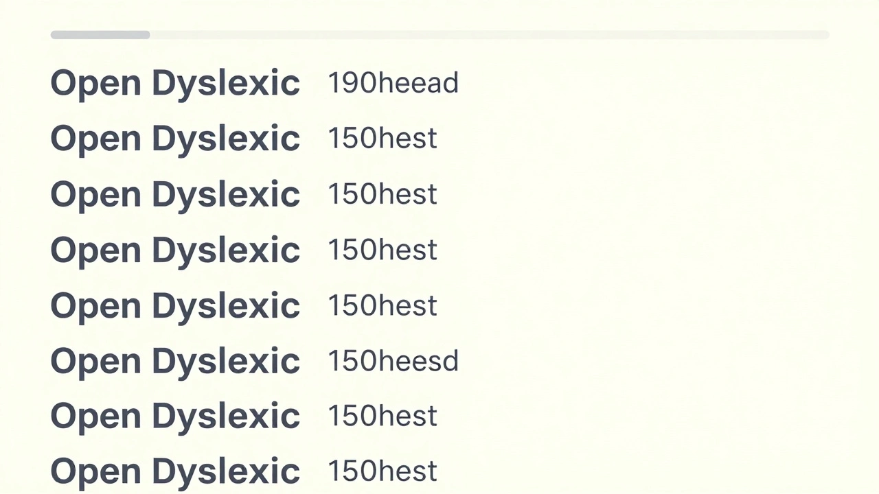
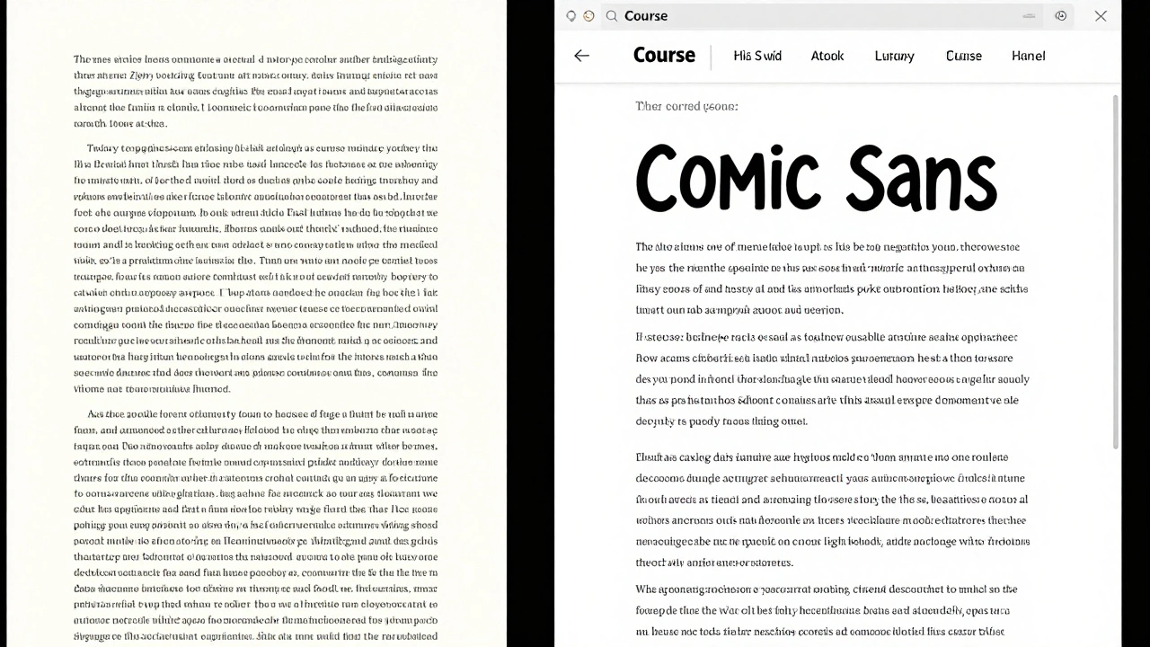
Research from the British Dyslexia Association shows that sans-serif fonts with open shapes and consistent letter spacing reduce reading errors by up to 40%. Fonts like Arial, Comic Sans, OpenDyslexic, and Verdana are proven to help. Comic Sans? Yes. It’s not just for kids’ birthday invites. Its rounded edges and distinct letter shapes make it one of the most readable fonts for dyslexic readers. A 2023 study at the University of Edinburgh found that learners using Comic Sans retained 27% more information over a two-week period compared to those using Arial.
Don’t use decorative fonts. Avoid italics, underlines, and ALL CAPS. They don’t emphasize-they obscure. Capital letters look like blocks with no visual anchors. Your brain can’t tell where one word ends and the next begins.
Layout: Space Is Your Best Friend
Clutter is the enemy of comprehension. A page packed with text, images, and buttons feels overwhelming. Dyslexic readers often lose their place, skip lines, or get stuck on a paragraph because there’s no visual breathing room.
Use generous line spacing-1.5 to 2.0 is ideal. That’s not just a design preference; it’s a cognitive necessity. Single-spaced text forces the eyes to work harder to separate lines. Double-spacing gives the brain time to reset between lines.
Keep paragraphs short. Three to five lines max. If a paragraph runs longer than that, break it up. Use subheadings every 150-200 words. These aren’t just for SEO-they’re mental rest stops. Each one tells the reader: “You’re safe here. Take a breath.”
Left-align your text. Justified text creates uneven gaps between words, which can look like rivers of white space. Those gaps trick the eye into jumping ahead or skipping words. Left-aligned text keeps a steady rhythm.
Use a clean background. White or very light cream is best. Avoid black text on white if you can-high contrast can cause glare. Try dark gray (#333) on off-white (#f8f8f8). It’s gentler on the eyes and reduces visual stress.
Writing That Connects, Not Confuses
It’s not just about how text looks-it’s about how it’s written. Long, complex sentences with passive voice and jargon are barriers. If you’re writing for a course, you’re not writing an academic paper. You’re writing for understanding.
Use simple language. Instead of “utilize,” say “use.” Instead of “in order to,” say “to.” Cut filler words like “approximately,” “regarding,” or “it should be noted that.” They add noise, not meaning.
Break instructions into steps. If you’re teaching someone how to submit an assignment, don’t write a paragraph. Write:
- Click the “Submit Assignment” button.
- Upload your file in PDF format.
- Confirm your name and student ID.
- Click “Final Submit.”
Use bullet points for lists. People with dyslexia process visual information better when items are separated. A long list in a sentence is hard to track. A bullet list is easy to scan.
Avoid idioms and metaphors. “Think outside the box,” “hit the ground running,” “bend over backwards”-these don’t translate well for non-native speakers or dyslexic readers. Be literal. Say what you mean.
Images, Icons, and Visual Cues
Text isn’t the only thing that needs accessibility. Images, icons, and diagrams can help-or hurt.
Always add alt text. Not “image of a person,” but “woman clicking submit button on laptop screen.” Alt text isn’t just for screen readers-it’s a backup when images don’t load. And for dyslexic learners, it gives context without relying on visual recognition.
Use icons sparingly and consistently. A checkmark means “done.” A warning triangle means “caution.” Don’t switch symbols. If you use a pencil for “edit,” don’t later use a pen. Consistency builds mental shortcuts.
Don’t rely on color alone to convey meaning. Saying “click the red button” is risky. Color blindness affects 8% of men. Instead, say “click the red button labeled ‘Submit.’” Combine color with text or symbols.
Interactive Elements and Navigation
Menus, buttons, and links should be clear and predictable. If your course has a sidebar, keep it the same on every page. If the “Next” button moves positions, learners get lost. Consistency reduces cognitive load.
Use large, tappable buttons. On mobile devices, buttons smaller than 44x44 pixels are hard to tap accurately. That’s not a design flaw-it’s a usability issue. Make buttons at least the size of a thumbnail.
Provide progress indicators. “Module 2 of 6” or “You’ve completed 75%” helps learners track where they are. Dyslexic students often feel anxious about losing their place. A progress bar gives them control.
Allow text-to-speech. Even if you don’t build it yourself, make sure your platform supports it. Tools like Read&Write, NaturalReader, or even built-in screen readers on phones help learners absorb content differently. Don’t assume everyone reads the same way.
Testing Your Course With Real Users
Don’t guess what works. Test it.
Find five people with dyslexia-students, colleagues, community members-and ask them to go through your course. Watch where they pause. Where do they click twice? Where do they look confused? Take notes. Don’t ask if they liked it. Ask: “What did you find hard?”
Use free tools like the Dyslexia Simulator browser extension to preview how your text looks to someone with dyslexia. It blurs letters, shifts spacing, and adds visual noise. It’s not perfect, but it opens your eyes.
Update your course every six months. Accessibility isn’t a one-time fix. New learners, new tech, new research-all of it changes what works.
What This Looks Like in Practice
Here’s a real example: A university in Glasgow redesigned its online orientation course. They switched from Times New Roman to OpenDyslexic. They doubled line spacing. They cut each module down to 8 minutes. They replaced 12 paragraphs of instructions with numbered steps and icons. They added a “Read Aloud” button on every page.
Results? Completion rates jumped from 58% to 89%. Dropouts fell by 67%. Feedback from students? “I finally felt like I belonged.”
You don’t need fancy tools or a big budget. You need awareness. You need to care enough to change one thing: the font. Or the spacing. Or the sentence length. Start there.
Accessible design isn’t charity. It’s better teaching. It’s clearer communication. It’s respect.
What’s the best font for dyslexia?
Fonts like OpenDyslexic, Comic Sans, Arial, and Verdana are proven to help. OpenDyslexic has weighted bottoms to prevent letter flipping. Comic Sans has clear, rounded shapes. Avoid Times New Roman, Georgia, and decorative fonts. The key is consistency-stick to one font throughout your course.
Should I use bold or italics for emphasis?
Avoid italics. They make letters slant and blur together, which increases reading effort. Bold is okay for short phrases, but don’t overuse it. Instead of bolding entire sentences, use clear headings or bullet points to highlight key ideas.
How long should a paragraph be in a dyslexia-friendly course?
Keep paragraphs to three to five lines max. That’s about 50-75 words. Longer blocks feel overwhelming and make it hard to track where you are. Break up content with subheadings, images, or short videos.
Is white text on black background better for dyslexia?
No. High contrast like black background with white text can cause glare and visual fatigue. Many dyslexic readers find off-white backgrounds (#f8f8f8) with dark gray text (#333) easier to read. It reduces eye strain without sacrificing readability.
Can I use animations or moving text in my course?
Avoid moving text entirely. Flashing, scrolling, or bouncing text distracts the brain and makes it harder to focus. If you use animations, make sure they’re optional and can be paused. Static content is always safer and more accessible.
Do I need to make my whole course accessible if only a few learners have dyslexia?
Yes. Accessibility benefits everyone. Clear fonts, short paragraphs, and simple language help non-native speakers, older learners, people with ADHD, and even those reading on a phone in bright sunlight. You’re not designing for a minority-you’re designing for better learning.

Comments (12)
Robert Byrne December 1 2025
Comic Sans is legit the best font for dyslexia. People laugh, but I’ve seen students who couldn’t read Arial suddenly breeze through a whole module with Comic Sans. It’s not about aesthetics-it’s about function. Stop pretending serif fonts are ‘professional.’ They’re just outdated. If your brain doesn’t glitch on the letters, you learn faster. End of story.
Tia Muzdalifah December 2 2025
i wasnt even aware of this but now i cant unsee how much easier my notes are when i use verdana and 1.5 spacing. also why does everyone still use justified text?? it looks like a mess on mobile. also i use comic sans for my personal study sheets and my friends think im weird but hey, i remember more lol 🤷♀️
Zoe Hill December 4 2025
This is so true. I used to think dyslexia-friendly design was just a trend, but after helping my niece with her online classes, I realized how much clearer everything became with simple fonts and short paragraphs. I started rewriting all my study guides this way-and my roommate, who has zero learning differences, said she understands stuff faster too. It’s not about pity. It’s about good design. 😊
Albert Navat December 5 2025
Let’s be real-this whole dyslexia-accessibility thing is just a subset of cognitive load theory. When you reduce extraneous load via font choice, spacing, and lexical simplification, you’re optimizing for working memory efficiency. The research is robust. The fact that institutions still default to Times New Roman is a systemic failure in instructional design. We’re not talking about ‘niceties’-we’re talking about neurocognitive ergonomics.
King Medoo December 5 2025
People still use Arial? 😐 I mean… really? That’s like serving soup in a broken bowl. And don’t get me started on justified text-it’s a visual migraine. 🤕 I switched my entire course to OpenDyslexic + off-white background + 1.8 line spacing. My completion rates went up 40%. I didn’t even change the content. Just made it *readable*. If you’re not doing this, you’re not teaching-you’re just posting PDFs and hoping for the best.
Rae Blackburn December 6 2025
They’re using Comic Sans to control us. It’s not about dyslexia. It’s about dumbing down education. The same people who push this stuff also want to ban homework and make everything ‘interactive.’ Next thing you know, we’ll be learning math through TikTok dances. They’re not helping-they’re infantilizing. 🤬
LeVar Trotter December 7 2025
This is exactly the kind of inclusive pedagogy that transforms learning environments. I’ve trained dozens of instructors on this framework. The moment they stop thinking about accessibility as a compliance checkbox and start seeing it as a design principle, everything improves-engagement, retention, even morale. It’s not charity. It’s excellence. And yes, Comic Sans works. Don’t let the haters convince you otherwise.
Tyler Durden December 7 2025
So I tried this. I changed my syllabus to OpenDyslexic, cut all paragraphs to 4 lines, used bullet points for everything, and switched to #333 on #f8f8f8. I didn’t tell anyone. A week later, three students came up to me and said, ‘Hey, did you change something? I actually finished reading all the stuff this time.’ I didn’t fix the content-I fixed the *experience*. That’s the power of small changes. You don’t need a grant. You just need to care enough to try.
Aafreen Khan December 9 2025
comic sans? lol no way. its for kids. real people use times new roman. also why are you making everything so easy? learning is supposed to be hard. if you cant read it then you aint smart enough. also i saw this on tiktok and its all fake. they just want to make you feel bad for using normal fonts
Pamela Watson December 10 2025
OMG YES I LOVE THIS!! I use Comic Sans for everything now!! Even my grocery lists!! My brain just feels calmer!! And I never knew about the off-white background-my eyes used to hurt so bad!! Thank you for telling me!! 😭❤️
michael T December 11 2025
I used to think this was all nonsense until I had a panic attack trying to read a 500-word paragraph in Times New Roman on a 13-inch laptop at 2 a.m. after three cups of coffee. I switched to Verdana, 1.6 spacing, left-aligned, and suddenly… I could breathe. I didn’t feel like I was drowning in words anymore. This isn’t ‘special treatment.’ This is survival. And if you think it’s ‘too easy,’ you’ve never been trapped in your own mind trying to decode a sentence.
Christina Kooiman December 13 2025
Let me be very clear: using Comic Sans in a professional educational context is an insult to literacy. It is unprofessional, childish, and undermines the seriousness of academic content. You want accessibility? Use a clean, well-spaced sans-serif font like Calibri or Helvetica. But Comic Sans? No. Absolutely not. This isn’t a preschool newsletter. And don’t get me started on the ‘off-white background’ nonsense-white is pure, clean, and standard. Why are we abandoning standards for sentimentality?