When you use a high contrast theme, a visual design that sharply differentiates text from background using dark and light colors. Also known as high visibility mode, it’s not just for people with low vision—it’s a simple fix that helps anyone focus better on screens, especially in bright light or on older devices. Many online courses, learning platforms, and business tools now offer this option because it reduces eye strain, improves readability, and makes content more inclusive.
High contrast themes relate directly to digital accessibility, the practice of designing websites and apps so people with disabilities can use them equally. This isn’t optional anymore. In the UK and EU, public sector websites must follow WCAG guidelines, and high contrast is one of the easiest ways to meet those standards. But even if you’re not legally required to do it, offering high contrast options improves user experience, how easy and pleasant it is for people to interact with your digital tools. Think about it: if your course PDFs, LMS dashboard, or training portal uses light gray text on white, you’re losing learners—not just those with vision issues, but anyone working on a phone in sunlight or in a dimly lit office.
Most of the posts in this collection focus on tools and systems used by educators, trainers, and online course creators—LMS platforms, PDFs, webhooks, accessibility features. And every single one of them can be made better with high contrast themes. Whether you’re designing an exam interface, setting up a learning management system, or creating downloadable course materials, choosing the right color pairs isn’t a design luxury. It’s a functional requirement. You don’t need fancy software to do it. Most tools like LearnWorlds, Teachable, or even Word and Adobe Acrobat let you toggle or customize contrast settings. The real question is: are you using them?
Some people think high contrast looks harsh or unprofessional. That’s outdated. Modern high contrast themes use deep navy instead of pure black, soft cream instead of white, and carefully balanced tones that feel clean, not clinical. They’re used by major tech companies, government services, and top education platforms because they work. They reduce errors, increase completion rates, and make content stick. If your learners are dropping out, missing instructions, or struggling to read text, check the contrast first. It’s often the simplest fix you haven’t tried yet.
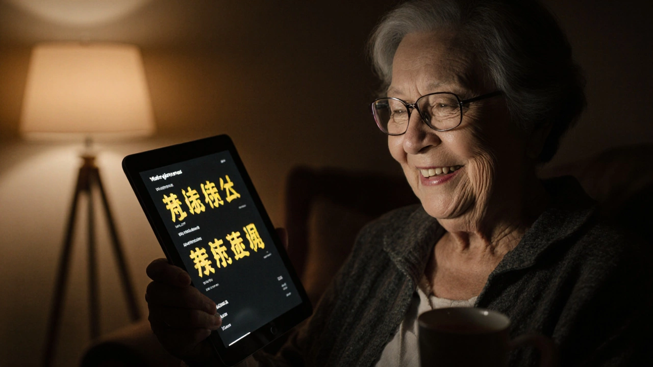
Dark mode and high contrast themes in learning apps reduce eye strain, improve focus, and make education accessible to people with vision challenges. They’re not optional-they’re essential for effective learning.
© 2026. All rights reserved.