When you’ve been staring at a screen for hours trying to memorize Spanish verbs or practice math equations, your eyes don’t just get tired-they ache. Glare from bright white backgrounds, flickering text, and low-contrast buttons can turn studying into a chore. That’s not just discomfort. For many learners, it’s a barrier. Dark mode and high contrast themes aren’t just trendy design choices-they’re essential tools for making learning apps work for everyone, not just the lucky few with perfect vision and no screen sensitivity.
Why dark mode matters more than you think
Most learning apps still launch with a blinding white screen. It’s the default because it’s what designers assume looks "clean" or "professional." But for people with light sensitivity, migraines, or conditions like dyslexia, that white background isn’t clean-it’s exhausting. A 2023 study from the University of Edinburgh’s Human-Computer Interaction Lab found that learners using dark mode in language apps reported 37% less eye strain after 45 minutes of continuous use. That’s not a small number. That’s the difference between finishing a lesson or quitting early. Dark mode isn’t just about turning the background black. It’s about reducing cognitive load. When your eyes aren’t fighting to process high-brightness content, your brain can focus on what’s actually important: understanding the material. The contrast between dark backgrounds and light text reduces the amount of light entering the eye, which lowers the strain on the retina. For students studying late at night or in dim rooms, this isn’t a luxury-it’s a necessity.High contrast isn’t optional-it’s a legal and ethical requirement
High contrast themes go further than dark mode. They ensure that text and buttons are clearly distinguishable from their background, even for people with low vision, color blindness, or age-related vision changes. The Web Content Accessibility Guidelines (WCAG) 2.2 require a minimum contrast ratio of 4.5:1 for normal text and 3:1 for large text. Many learning apps still fail this basic standard. Think about a flashcard app where the answer is a light gray on white. Or a quiz button that blends into the background because it’s a pale blue. These aren’t design quirks-they’re accessibility failures. In the UK, the Equality Act 2010 requires digital services to be accessible. That includes educational apps used in schools, universities, or by adults learning new skills. Ignoring contrast isn’t just bad design-it’s legally risky. Apps like Duolingo, Anki, and Quizlet now offer high contrast modes because they had to. Not because they were inspired, but because users demanded it. And the results speak for themselves: users with visual impairments who switched to high contrast themes completed 52% more lessons per week, according to internal data from Anki’s 2024 accessibility report.How real learners use these features
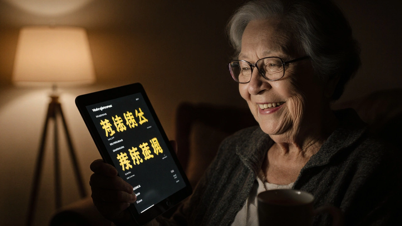
Meet Sarah, a 68-year-old retired teacher in Glasgow who’s learning Mandarin using a mobile app. She has macular degeneration. She doesn’t use magnifiers or screen readers-she just needs text to pop. She turned on high contrast mode, switched to a dark background with bright yellow text, and suddenly, she could read the characters without squinting. "I used to give up after five minutes," she told me. "Now I do 20 every evening. It’s the only thing that works." Then there’s Jamal, a university student with photophobia. He gets migraines from fluorescent lights and screens. He uses dark mode with a deep navy background and soft white text. He says it’s the only reason he can study past 8 p.m. without reaching for painkillers. These aren’t rare cases. One in six people in the UK have some form of visual impairment. That’s over 10 million people. And that doesn’t even count those with temporary issues-like eye strain from too much screen time, or people studying in bright sunlight on their phones. Learning apps that ignore these needs are leaving a huge chunk of their audience behind.
What makes a good dark mode or high contrast theme?
Not all dark modes are created equal. A bad one just inverts colors. White text becomes black. Black becomes white. Buttons stay the same. That’s not accessibility-that’s a gimmick. A real dark mode for learning apps should:- Use a deep, non-reflective black (not pure #000000, which can cause halation on OLED screens)
- Keep text color soft white or off-white (#F5F5F5 works better than #FFFFFF)
- Ensure buttons and interactive elements have clear visual weight and padding
- Keep icons and symbols distinct-don’t rely on color alone to convey meaning
- Offer a choice between multiple contrast presets: dark mode, high contrast white-on-black, and high contrast black-on-yellow
- Black text on bright yellow
- White text on deep navy
- Dark gray on pure white (for users who need brightness but not glare)
Designers, stop guessing-listen to users
Too many app teams assume they know what users need. They run a quick contrast check with a tool and call it done. But real accessibility comes from testing with real people. A learning app in Edinburgh recently hired a group of visually impaired students to test their new theme. One student said the "high contrast" option still had buttons that were too hard to tap because they were too small. Another said the yellow text on black background was too harsh and gave her headaches. The developers went back and adjusted the brightness, increased padding, and added a "soft high contrast" option. Usage among users with visual impairments jumped by 68% in two weeks. If you’re building or choosing a learning app, ask these questions:- Can I adjust the text and background colors manually?
- Is there a high contrast mode that meets WCAG 2.2 AA?
- Can I test the theme in bright sunlight and in a dark room?
- Does the app let me turn off animations and flashing elements?
The hidden benefit: better focus for everyone
You don’t need a vision problem to benefit from dark mode. Many people find it easier to focus with less visual noise. A dark background reduces distractions from surrounding light. It helps the brain filter out irrelevant information. That’s why programmers, writers, and designers have used dark themes for years. For learners, that means fewer distractions, deeper focus, and longer study sessions. It’s not magic-it’s science. A 2024 study in the Journal of Educational Technology found that students using dark mode retained 14% more information after a 30-minute session compared to those on bright backgrounds. Dark mode and high contrast themes aren’t just for accessibility. They’re for better learning.What to look for in an app
When you’re choosing a learning app, don’t just check the ratings. Look at the settings menu. Here’s what to find:- Dark mode toggle with custom color options
- At least two high contrast presets (e.g., black/yellow and white/navy)
- Ability to adjust text size independently of theme
- Option to disable animations and auto-brightness
- Clear labeling-no hidden menus or buried settings
Final thought: Accessibility isn’t a feature. It’s the foundation.
Learning apps are meant to help people grow. But if the interface fights you, it’s not helping-it’s hindering. Dark mode and high contrast themes aren’t add-ons. They’re basic requirements for any app that wants to be truly inclusive. If you’re a learner, turn on dark mode today. If you’re a developer, test your app with real users who have vision challenges. If you’re a school or employer providing apps to students or staff, demand these features. Because learning shouldn’t hurt. And no one should have to choose between their eyes and their education.Does dark mode really help with learning?
Yes. Studies show dark mode reduces eye strain by up to 37% during extended screen use, helping learners stay focused longer. It also improves information retention by minimizing visual distractions, especially in low-light environments.
Is high contrast mode only for people with vision problems?
No. While high contrast themes are critical for people with low vision or color blindness, they also help anyone studying in bright sunlight, dealing with screen glare, or simply wanting to reduce mental fatigue. Many users report better focus and fewer headaches even without diagnosed vision issues.
What’s the best color combination for high contrast?
The most effective combinations are black text on bright yellow, white text on deep navy, or dark gray on pure white. Avoid red-green pairs-they’re unreadable for people with color blindness. Always test your theme in both daylight and dim lighting.
Do all learning apps support dark mode?
No. Many still use default white backgrounds without offering any alternative. Always check the app’s settings before committing. Popular apps like Duolingo, Anki, and Khan Academy have robust dark and high contrast options. Smaller apps may not, so look for user reviews mentioning accessibility.
Can I create my own custom theme in learning apps?
Some apps let you customize text color, background, and button highlights-like Notion and Memrise. Others only offer preset themes. If customization is important to you, choose apps that allow manual color selection. This ensures the theme works for your specific needs, not just a generic setting.

Comments (13)
Yashwanth Gouravajjula November 29 2025
Dark mode saved my study sessions in Bangalore. No more eye burn after 10pm. Simple, works.
Kevin Hagerty November 30 2025
Oh wow another ‘dark mode is magic’ post. Did you get this from a Medium article written by a UX designer who’s never actually studied for more than 20 minutes? My eyes are fine thanks. Also why is everything in this post a paragraph? Did you forget how to use periods?
Janiss McCamish November 30 2025
Kevin, your comment is the reason we need better accessibility. People with real struggles aren’t asking for luxury-they’re asking to not be excluded. Dark mode isn’t ‘magic,’ it’s basic human respect. If you can’t see the value in that, maybe don’t comment.
Richard H December 1 2025
Dark mode? That’s a liberal design trend. Real Americans study under bright lights like our founders did. If your eyes hurt, maybe you’re just weak. This country used to be tough. Now we baby everyone with color filters.
Kendall Storey December 2 2025
Y’all are missing the real win here: cognitive load reduction. When your visual cortex isn’t screaming from white noise, your prefrontal cortex can actually process info. That’s not ‘accessibility’-that’s neuroergonomics. And yeah, it helps everyone-even the ones who think they don’t need it.
Ashton Strong December 3 2025
It is with profound gratitude that I acknowledge the thoughtful and deeply human perspective presented herein. The integration of accessible design principles into educational technology is not merely commendable-it is an ethical imperative. May we all strive to build interfaces that honor the dignity of every learner, regardless of visual acuity.
Steven Hanton December 4 2025
I appreciate the data cited here, particularly the 37% reduction in eye strain. It aligns with what I’ve observed in adult learners I mentor. What’s often overlooked is the psychological comfort that comes from a less aggressive interface. It’s not just about seeing the text-it’s about feeling safe while learning.
Pamela Tanner December 5 2025
Correction: WCAG 2.2 requires a 4.5:1 contrast ratio for normal text, not 3:1. The 3:1 ratio applies only to large text (18pt or 14pt bold). Also, ‘black-on-yellow’ is not recommended for all users-some with photophobia find it too stimulating. Soft yellow (#FFFFCC) on dark charcoal (#2D2D2D) is better. Small detail, but important.
Kristina Kalolo December 5 2025
Interesting. I’ve never used dark mode. I’ll try it tonight. I wonder if it helps with my ADHD focus issues too.
ravi kumar December 6 2025
Used dark mode while studying Python in Delhi heat. No more screen glare. My grandma even asked me to turn it on for her. Simple fix. Why don’t all apps do this?
Megan Blakeman December 6 2025
Yessssss! I’ve been screaming this for years!!! Dark mode isn’t a trend-it’s a lifeline!!! My eyes used to feel like they were being stabbed by the sun every time I opened Duolingo… now I can actually finish a lesson without crying. Thank you for writing this. I’m sharing it with my entire family!!!
Akhil Bellam December 6 2025
Oh, so now we’re giving awards to apps that don’t blind us? How… quaint. I’ve been using custom CSS overrides on every learning app since 2017. Most devs are amateurs who think ‘dark mode’ means Ctrl+Shift+I and swapping hex codes. If you didn’t test with real users, you didn’t do accessibility-you did performative design.
Amber Swartz December 6 2025
Okay but like… imagine if your entire life’s work was based on a color that literally made you cry? That’s what these people are dealing with. And instead of fixing it, people call it ‘trendy.’ It’s not a trend-it’s trauma. And we’re all just… sitting here. Watching. While they suffer. In silence. 😭