When you think about readable text design, the practice of organizing written content so it’s easy to read, understand, and navigate for all users, regardless of ability or device. Also known as text accessibility, it’s not a luxury—it’s the foundation of effective learning, training, and communication. If your audience can’t quickly grasp what you’re saying, no amount of great content will matter. This isn’t about fancy fonts or decorative layouts. It’s about removing friction. Think of it like a well-lit hallway with clear signs: no one should have to squint, guess, or struggle just to get to the next step.
Readable text design directly connects to accessible documents, files and materials formatted to be usable by people with visual, cognitive, or motor impairments. It also ties into learning app design, how digital education tools structure text, spacing, contrast, and navigation to support focus and retention. And it’s not just for students with disabilities. Anyone reading on a phone in bright sunlight, anyone with temporary vision strain, or anyone multitasking while learning benefits from clean, well-structured text. Studies show users retain 30% more information when text is optimized for readability—not because it’s prettier, but because it’s easier to process.
What makes text readable? It’s the small things: line spacing that doesn’t crowd words, contrast that pops off the screen, headings that break up chunks, and sentences that don’t drag on. It’s using plain language instead of jargon, even in technical fields. It’s knowing that a 12-point font isn’t automatically readable if the line height is too tight. These aren’t design trends—they’re basic human needs. And when you get them right, you don’t just help people with disabilities—you help everyone learn faster, remember longer, and stay engaged.
Behind every effective learning platform, certification program, or corporate training system is a team that prioritized readable text design. You’ll see it in how course PDFs are built to work with screen readers, how LMS platforms use color and spacing to guide attention, and how digital badges and progress trackers use clear labels instead of cryptic icons. It’s not always visible, but you feel it when it’s missing—and you notice it instantly when it’s done well.
Below, you’ll find real examples from educators, developers, and trainers who’ve tackled this challenge head-on. From fixing inaccessible PDFs to designing dark mode interfaces that reduce eye strain, these posts show exactly how readable text design works in practice—not in theory, but in classrooms, apps, and corporate systems across the UK and beyond.
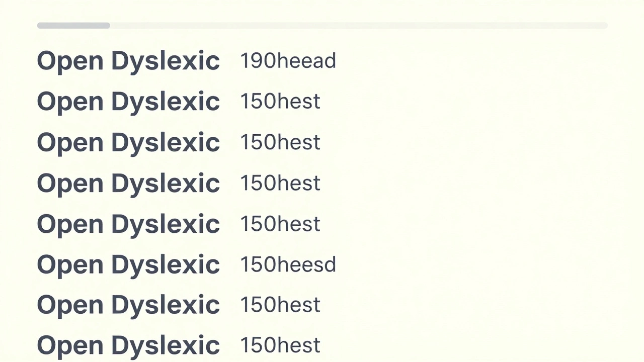
Discover how simple changes to fonts, layout, and writing style can make online courses easier to read and understand for people with dyslexia-and better for everyone.
© 2026. All rights reserved.