Most course PDFs are built for sighted, able-bodied users. They ignore people who use screen readers, those with low vision, color blindness, or motor impairments. If your course materials aren’t accessible, you’re not just excluding learners-you’re breaking the law in many countries, including the UK under the Equality Act 2010. The good news? Making your PDFs and documents accessible isn’t rocket science. It’s about small, intentional choices that make a huge difference.
Why Accessibility Matters More Than You Think
One in five adults in the UK lives with a disability. That’s not a small group-it’s your student body. A learner with dyslexia might struggle with dense, unstructured text. Someone with low vision might need to zoom in 300% without losing readability. A person using a screen reader can’t navigate a PDF that’s just a scanned image of a page. These aren’t edge cases. They’re real students trying to learn.
Accessible documents aren’t just ethical-they’re practical. Clear structure helps everyone. Headings make it easier to skim. Alt text helps when images don’t load. Consistent fonts reduce cognitive load. When you design for accessibility, you design for clarity. And clarity benefits every learner, not just those with disabilities.
Start with the Right Tool
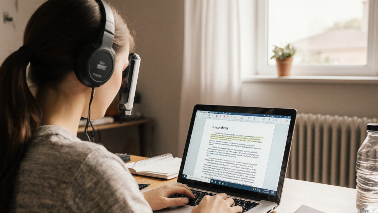
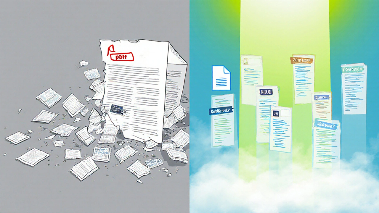
Not all PDF creators are equal. Microsoft Word and Google Docs are your best starting points. They let you build structure from the ground up. Avoid using Adobe Photoshop, Canva, or scanned images as your base. A scanned PDF is just a picture. Screen readers can’t read it. No amount of tagging will fix that.
Use Word or Docs to write your content. Apply real headings (Heading 1, Heading 2), not just bold or larger text. Use the built-in styles. These aren’t just formatting-they’re semantic structure. When you export to PDF from these tools, the accessibility layer comes with it.
Always export as PDF/A or use the ‘Create Accessible PDF’ option in Word’s Save As dialog. In Google Docs, go to File > Download > PDF Document (.pdf). Then open it in Adobe Acrobat Pro to check and fix any remaining issues.
Structure Is Everything
Think of your document like a book. A book has chapters, sections, subsections. Your PDF should too. Use heading levels properly: H1 for the title, H2 for major sections, H3 for subsections. Don’t skip levels. H1 to H3 to H5? That confuses screen readers. They rely on hierarchy to navigate.
Use lists-bulleted or numbered-when you have items. Don’t use dashes or arrows to fake a list. Screen readers announce “list item” and count them. That tells users how much content they’re about to hear. A real list also lets users jump between items quickly.
Tables should only be used for actual tabular data. Never use tables to arrange text visually. If you need to lay out two columns, use Word’s column feature, not a table. Screen readers read tables row by row. If your table is just for layout, it becomes noise.
Text That Works for Everyone
Font choice matters. Stick to sans-serif fonts like Arial, Calibri, or Helvetica. They’re easier to read on screens and for people with dyslexia. Avoid Times New Roman-it’s harder to distinguish letters like ‘a’ and ‘o’ when zoomed in.
Font size? Minimum 12pt. 14pt is better. Don’t rely on users zooming in to fix small text. Make it readable at the source. Line spacing should be at least 1.5. Single spacing feels cramped. Double spacing is fine if it doesn’t make the document too long.
Text color? Never use color alone to convey meaning. If you say “click the red button,” someone who’s colorblind won’t know which one to pick. Always add text labels: “click the red button (labeled ‘Submit’)”. Use contrast checkers. Text should have at least a 4.5:1 contrast ratio against its background. White text on light gray? That fails. Black on white? That passes.
Images, Charts, and Graphics
Every image needs alt text. Not just “image of a graph.” That’s useless. Say what the image says. For a bar chart showing student pass rates: “Bar chart showing 87% pass rate in 2024, up from 72% in 2023.”
Complex visuals like diagrams, flowcharts, or infographics need longer descriptions. Don’t put them in the alt text-it’s too short. Instead, add a caption below the image: “See full description below.” Then, on the next page or in a separate section, write a detailed paragraph explaining the visual. Link to it if possible. Or, if you’re using Word, use the “Alt Text” pane to add a long description field.
For charts, always provide the raw data in a table below. That way, someone using a screen reader can access the numbers even if they can’t see the chart.
Links and Interactive Elements
Don’t use “click here” or “read more.” Those phrases mean nothing to someone using a screen reader. They hear a list of 20 “click here” links. What’s the difference? You don’t know.
Instead, use descriptive link text: “Download the 2024 course syllabus (PDF, 2.4 MB)” or “View the lab safety guidelines on the university portal.” Include file type and size. That helps users decide whether to download or open.
If your PDF has form fields-like checkboxes or text boxes-make sure they’re properly tagged as form fields in Acrobat. Test them with a screen reader. Can you tab through them? Can you fill them out? If not, go back and fix the tagging.
Test Your Document Like a User
Don’t assume your PDF is accessible. Test it. Use free tools:
- Adobe Acrobat Pro > Tools > Accessibility > Full Check. It finds missing alt text, poor contrast, missing headings.
- Microsoft Word > Review > Check Accessibility. It gives you a list of issues before you export.
- Screen Reader > Use NVDA (free for Windows) or VoiceOver (built into Mac). Turn it on and listen to your PDF. Can you navigate it? Can you understand it?
Ask someone with a disability to test it. Not as a token gesture-because they’re the experts. If you work in education, reach out to your disability support office. They’ll help you test and improve.
Common Mistakes to Avoid
- Scanning paper documents and calling them PDFs-this creates inaccessible images.
- Using text boxes or text wrapped around images-screen readers read them out of order.
- Putting important text in footers or headers-screen readers often skip them.
- Using PDFs as the only format-offer Word or HTML versions too. Not everyone can open or edit PDFs.
- Forgetting to set the document language. In Acrobat, go to Document Properties > Advanced > Language. Set it to English (UK) if that’s your audience.
What Accessible Looks Like in Practice
Here’s what a real accessible course PDF looks like:
- Title: “Introduction to Psychology - Module 1” (H1)
- Section: “Key Theories” (H2)
- Subsection: “Freud’s Model of the Mind” (H3)
- Image: “Diagram of Freud’s id, ego, superego” with alt text: “Diagram showing three layers: id (bottom, primal urges), ego (middle, reality-based), superego (top, moral standards)”
- Table: “Comparison of Freud, Piaget, and Vygotsky” with clear headers and data
- Link: “Download full reading list (Word document, 1.2 MB)”
- Page language: English (United Kingdom)
That’s it. No fancy animations. No hidden layers. Just clear, structured, labeled content.
Next Steps: Make It a Habit
Accessibility isn’t a one-time task. It’s a mindset. Start by making every new document you create accessible. Then go back and fix the old ones-start with the most used ones.
Train your team. Share a one-page checklist. Make accessibility part of your course design workflow. If you’re using a learning management system like Moodle or Canvas, check if it has built-in accessibility tools. Most do.
When you make documents accessible, you’re not just helping students with disabilities. You’re helping the student who’s studying on their phone on the bus. The one with dyslexia. The one whose eyes are tired after a long shift. The one learning English as a second language. Everyone wins.
Are PDFs inherently inaccessible?
No, PDFs aren’t inherently inaccessible. A poorly made PDF is inaccessible. But a well-structured PDF created in Word or Google Docs and properly tagged in Adobe Acrobat can be fully accessible. The issue isn’t the format-it’s how it’s built.
Do I need Adobe Acrobat Pro to make accessible PDFs?
You don’t need it to create them, but you do need it to fix them. Word and Google Docs can generate accessible PDFs if you use proper headings and styles. But if you’re given a scanned PDF or one with errors, Adobe Acrobat Pro is the only tool that lets you add alt text, fix reading order, and tag elements properly. Free tools like PDFtk or online converters won’t help with tagging.
Can I use Canva or PowerPoint for course documents?
It’s risky. Canva and PowerPoint make it easy to create beautiful layouts-but they often break accessibility. Text can be placed in untagged boxes, headings aren’t properly marked, and exported PDFs lose structure. If you must use them, always export to PDF and then open it in Acrobat to fix the tagging. Better yet, write the content in Word first, then copy it over.
What if my institution doesn’t require accessible documents?
Even if it’s not required, it’s still the right thing to do. In the UK, the Equality Act 2010 requires public institutions to make reasonable adjustments for disabled people. Course materials are part of that. If you’re not providing accessible documents, you could be discriminating by omission. Start small. One accessible document at a time. It adds up.
How do I know if my PDF is WCAG compliant?
WCAG 2.1 Level AA is the standard most institutions follow. Use Adobe Acrobat’s Accessibility Checker-it flags issues against WCAG. You should also test with a screen reader. If you can navigate the document, understand headings, hear alt text, and read all links clearly, you’re likely compliant. For full compliance, aim for no errors in the checker and zero barriers during manual testing.

Comments (14)
Jeremy Chick November 17 2025
Bro, I just scanned a syllabus last week and called it a PDF. No one complained. Maybe accessibility is just woke corporate theater? 🤷♂️
Megan Ellaby November 19 2025
I love this so much. I teach ESL and my students with dyslexia finally stopped giving up on readings after I started using Calibri and alt text. It’s not hard, just thoughtful. Thanks for the reminder.
Also, font size 14? Yes. Please. My eyes thank you.
Sagar Malik November 20 2025
Let’s be real - this whole accessibility movement is just a Trojan horse for technocratic hegemony. The ruling class wants you dependent on tagged PDFs so they can monitor your cognitive engagement patterns. WCAG? More like WCG - Watchful Control Grid.
And don’t get me started on Adobe Acrobat Pro - owned by Big Software. Use LibreOffice. Fight the system.
Also, ‘sans-serif’ is just a marketing term. Helvetica is a fascist typeface. Use Comic Sans. It’s honest.
Also also - who says dyslexia isn’t a superpower? Maybe the real problem is that neurotypicals can’t handle non-linear thought.
Also also also - I once saw a PDF that had alt text for a blank page. That’s not accessibility. That’s performative virtue signaling.
Renea Maxima November 20 2025
Ugh. Another ‘accessible PDF’ lecture. Next you’ll tell me I need to caption my cat videos. 😒
Some of us just want to read without being lectured about ‘semantic structure.’
Also, why is everyone suddenly so concerned about ‘low vision’? I’ve got 20/10 vision and I hate reading PDFs too. Maybe the problem isn’t the PDF - it’s the internet.
Also also - I read everything in 200% zoom. So why do I need alt text? I can see the image.
Also also also - I’m not paying for a screen reader. Let the disabled people pay for their own tech. #Freedom
Rahul U. November 22 2025
Beautiful breakdown. I’ve been teaching this to my students in Mumbai - especially the part about not using tables for layout. So many of them use Canva for assignments and don’t realize how broken the export is.
Also, testing with NVDA is a game-changer. I did it once and cried. Not because I was sad - because I realized how much I’d been ignoring.
And yes - ‘click here’ is the worst. I used to do it. Now I cringe.
🙏 Thank you for this. Shared with my whole department.
E Jones November 23 2025
Let me tell you what they don’t want you to know - this isn’t about accessibility. This is about control. Who owns the narrative? Who decides what ‘proper heading structure’ means? The same people who told you serif fonts are ‘professional’ and now they’re telling you sans-serif is ‘inclusive.’
And Adobe Acrobat Pro? That’s not a tool - it’s a surveillance engine. Every time you tag an image, you’re feeding metadata into a corporate database that tracks your teaching habits.
They want you to think accessibility is moral. It’s not. It’s compliance. And compliance is the first step to total digital submission.
And don’t even get me started on ‘language settings.’ That’s how they track your nationality. English (UK)? That’s not a preference - that’s a colonial imprint.
Just print it. On paper. Burn the PDF. Be free.
selma souza November 25 2025
‘Font size 12pt’? That’s not enough. It’s 14pt minimum, and even then, you need to specify ‘14pt Calibri, 1.5 line spacing.’
Also, you said ‘use real headings’ - but you didn’t mention that Heading 1 must be used only once. That’s WCAG 2.1 Success Criterion 1.3.1.
And alt text must be concise - under 125 characters - unless it’s a complex graphic, in which case you must use a longdesc attribute or a linked description. You missed that.
Also, PDF/A is outdated. Use PDF/UA. And don’t forget to set the document title in the metadata, not just the first heading.
This guide is well-intentioned, but sloppy. You’re doing more harm than good by leaving out the technical specifics.
Lissa Veldhuis November 26 2025
Oh my god I can’t believe people still use Word to make PDFs. Like, really? You’re telling me we’re still stuck in 2012?
And alt text? Please. I’ve seen alt text that says ‘image of a graph’ - that’s not helping anyone. That’s just lazy. You’re not helping the blind - you’re just checking a box.
And why is everyone acting like this is hard? It’s not. It’s just not convenient. And convenience is the enemy of equity.
Also - who’s the idiot who wrote ‘don’t use Canva’? I made a whole syllabus in Canva and it looks gorgeous. You’re just jealous because you can’t design.
Also also - I bet half the people reading this are using Times New Roman and calling it ‘professional.’ You’re all part of the problem.
James Boggs November 27 2025
Thank you for this. Clear, practical, and human. I’ve shared it with our instructional design team. We’re making all new course materials accessible starting next semester. Small steps, big impact.
Also - the ‘click here’ point? Game changer. We changed every link in our LMS. Student feedback improved immediately.
Addison Smart November 28 2025
I’m from the U.S. but teach in Ghana - and I can tell you, this advice is universal. We don’t have fancy tools, but we use Google Docs and free screen readers. The difference in student engagement? Night and day.
One student told me, ‘I finally felt like I belonged in class.’ That’s not a checklist. That’s a life.
Also - I’ve started having students review each other’s documents for accessibility. It’s become part of the curriculum. They’re learning empathy through structure.
This isn’t about compliance. It’s about connection.
Frank Piccolo November 28 2025
Why are we even talking about this? In America, we don’t need to make PDFs accessible. We have the ADA. If they can’t read it, they should’ve gone to a better school.
Also - who’s paying for this? Taxpayers? No thanks. Let the schools that care about this pay for it. Not me.
And ‘reasonable adjustments’? What’s reasonable? I’m not adjusting my entire workflow because someone can’t see the screen.
Also - I used to make accessible PDFs. Then I got tired of the guilt trips. Now I just give PDFs. Let them deal with it.
Barbara & Greg November 29 2025
While I applaud the intent of this guide, it is fundamentally flawed in its premise. Accessibility is not a moral imperative - it is a legal obligation, and as such, should be enforced by regulation, not persuasion. The notion that ‘everyone benefits’ is a rhetorical device designed to dilute the specificity of disability rights. This is not about clarity. This is about justice.
Furthermore, the suggestion that Word and Google Docs are ‘best starting points’ is dangerously naive. These platforms are proprietary, closed-source systems that encode ableist assumptions into their default templates. True accessibility requires open, standards-based formats - Markdown, EPUB, or plain text. PDFs, by their very nature, are archival containers - not dynamic learning environments.
One must ask: are we designing for learners, or for institutional convenience?
David Smith November 29 2025
Okay but like - what if I just… don’t care? Like, I’m tired. I have 300 students. I’m not going to tag every image. Someone else can do it.
Also - I made a PDF with a background image. It looks sick. You’re telling me I can’t do that? I’m not making a textbook. I’m making a vibe.
Also - my students don’t complain. So why fix what ain’t broke?
Also - I heard someone say ‘accessible PDFs are a scam.’ And now I’m not sure what to believe.
Also - can we just go back to paper handouts? They never broke.
Renea Maxima December 1 2025
Wait, I just read this again… and I’m not mad. Maybe I was wrong.
My cousin’s kid is blind. He uses a screen reader. I never thought about what his PDFs looked like.
…I’m gonna fix my syllabus.
Thanks, I guess.