
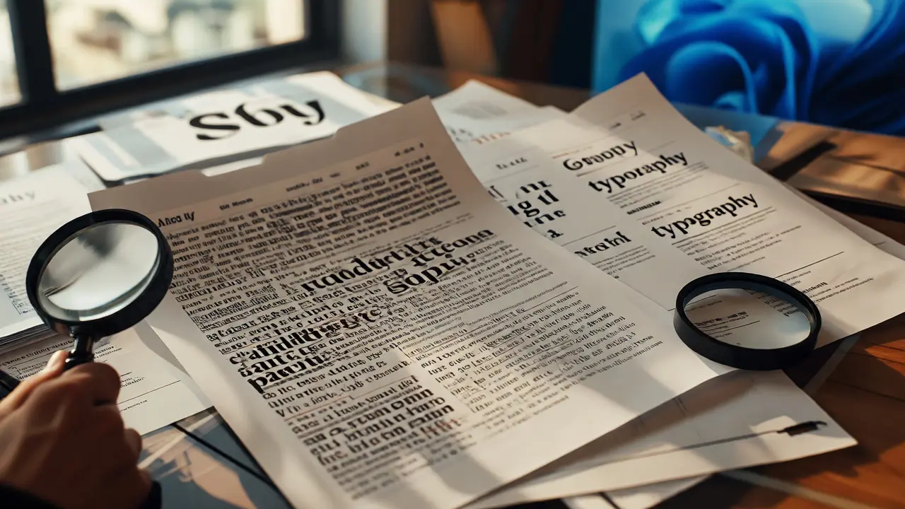
You know that feeling when you look at a menu or a website and something just feels off? It’s not the colors, and it’s definitely not the layout. It’s the text. Maybe the letters are too cramped, or the fonts clash like oil and water. That gut reaction? That is typography working against you. And here is the truth most beginners miss: good typography isn’t about having an artistic eye; it’s about following rules. Once you learn them, you can fix bad design in seconds.
If you are trying to figure out where to start with typography and font selection, you don’t need a four-year degree. You need a structured path. This guide breaks down exactly how to learn typography through practical exercises, what resources actually work, and how to stop making rookie mistakes that scream "amateur."
The Core Skills You Actually Need
Before you buy another book on calligraphy, let’s get real about what matters. Typography isn’t just about picking pretty letters. It’s about readability, hierarchy, and mood. When you take a course, make sure it covers these three pillars:
- Readability vs. Legibility: Can I read this paragraph without squinting? (Legibility). Do my eyes flow naturally from line to line? (Readability).
- Hierarchy: Which word should the reader see first? Second? Third? If everything looks the same size and weight, nothing stands out.
- Tone Matching: Does a playful comic sans vibe fit a law firm’s annual report? (Spoiler: No.)
A lot of free tutorials skip the "why" and jump straight to "pick this font." But if you don’t understand the mechanics, you’ll be stuck guessing forever. The best courses teach you to analyze typefaces as tools, not just decorations.
Where to Learn: Free vs. Paid Paths
Do you need to pay $500 for a certificate? Probably not. But do you need structure? Absolutely. Here is the breakdown of the most effective learning routes available right now.
| Resource Type | Best For | Cost | Key Advantage |
|---|---|---|---|
| Canva Design School | Total beginners who want quick wins | Free | Interactive, bite-sized lessons |
| Coursera / Skillshare | Structured theory + peer feedback | $15-$30/month | Access to industry pros and assignments |
| TypeScale.com | Understanding vertical rhythm | Free | Visual calculator for spacing |
| Google Fonts | Practical application & testing | Free | Real-time preview of pairings |
I usually recommend starting with Canva Design School. It’s not fancy, but it gets you moving. Then, move to Skillshare for deeper dives into specific topics like kerning or grid systems. The key is to apply what you learn immediately. Don’t watch ten videos in a row. Watch one, then open your design software and try it.
Exercise 1: The Pairing Challenge
This is the single most useful exercise for mastering font selection. Most people struggle because they think they need to find the "perfect" combination. In reality, you just need contrast.
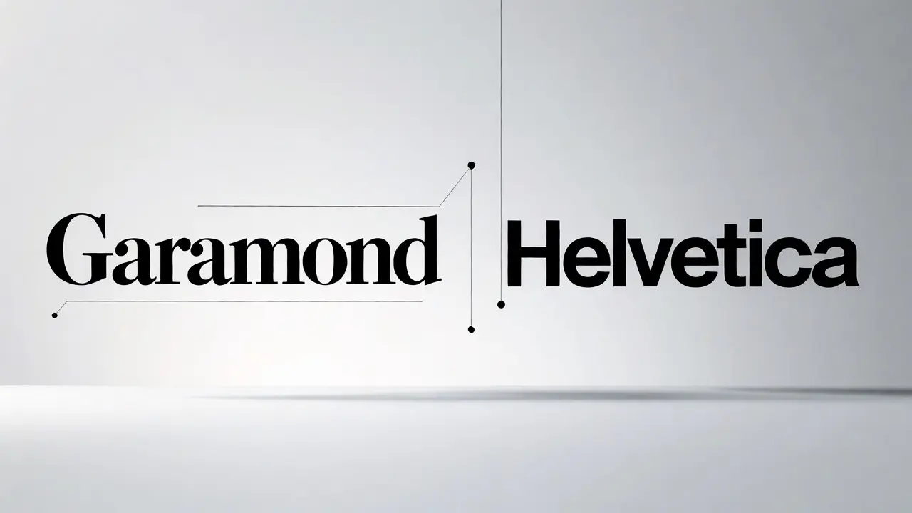
The Task: Take a blank canvas. Pick one serif font (like Garamond) and one sans-serif font (like Helvetica). Create a simple poster with a headline, subhead, and body text.
The Rules:
- Use only two fonts. Never three.
- Make the headline significantly larger than the body text (at least 2x).
- Change the weight (bold/light), not just the style, to create emphasis.
Why does this work? Because it forces you to rely on size and weight rather than hiding behind decorative fonts. If you can make Garamond and Helvetica look professional together, you can make any two fonts work. Try swapping the roles. Use the serif for the body and the sans-serif for the header. Notice how the mood shifts? That’s power.
Exercise 2: The Kerning Hunt
Kerning is the space between individual characters. Bad kerning makes words look awkward, like "AV" or "To." It’s subtle, but fixing it instantly upgrades your design quality.
The Task: Open a magazine or a high-end brand website. Zoom in until you can see the edges of the letters. Look for gaps that feel too wide or too tight.
The Practice: In your design tool, type the word "WAVE." Adjust the space between the 'A' and 'V'. Then adjust the 'V' and 'E'. Try to make the visual space between all letters equal, even though the physical space might differ. This trains your eye to spot errors in other people’s work.
Common Pitfalls Beginners Fall Into
I’ve reviewed hundreds of student portfolios, and the same mistakes pop up constantly. Avoid these traps to speed up your learning curve.
- Using more than two fonts per project. One for headings, one for body. Done. Adding a third usually creates chaos, not complexity.
- Ignoring line height (leading). If your lines are too close, readers lose their place. If they’re too far apart, the text falls apart. Aim for 1.4 to 1.6 times the font size for body text.
- Choosing trendy fonts over readable ones. Just because a font is popular on Instagram doesn’t mean it works for a long-form article. Test your choice by printing it out or reading it on a small screen.
- Centering everything. Left-aligned text is easier to read for long paragraphs. Center alignment is fine for short headlines, but avoid it for blocks of text.
Building Your Personal Type Library
You don’t need to memorize every typeface ever created. You need a reliable set of go-to fonts. Start building a personal library of 5-7 versatile families. Here is a solid starter kit for 2026:
- Sans-Serif Neutral: Inter or Roboto. Clean, modern, and works everywhere.
- Serif Classic: Merriweather or Georgia. Great for readability in long texts.
- Display Bold: Bebas Neue or Montserrat ExtraBold. Perfect for loud headlines.
- Monospace: Fira Code or Courier New. Adds a technical or retro vibe.
When you have a trusted set, you spend less time searching and more time designing. Experiment with new fonts only after you’ve mastered these basics.
Next Steps: From Student to Practitioner
Typography is a skill you refine by doing, not just studying. After completing the exercises above, pick a real-world project. Redesign a local restaurant menu or a personal blog post. Apply the rules of hierarchy and pairing you learned. Get feedback. Ask friends which version is easier to read. Their answers will tell you more than any textbook.
Remember, good typography is invisible. If people notice the font, you might have failed. If they notice the message, you succeeded. Keep practicing, keep tweaking, and soon you’ll spot bad kerning from across the room.
How many fonts should I use in a single design?
Stick to a maximum of two distinct typefaces. Typically, one is used for headings and titles, while the second is used for body copy. Using more than two often leads to a cluttered and unprofessional look unless you are an advanced designer managing complex editorial layouts.
What is the difference between serif and sans-serif fonts?
Serif fonts have small lines or strokes attached to the end of larger strokes in a letter (like Times New Roman). Sans-serif fonts do not have these extra details (like Arial). Serifs are traditionally considered better for printed long-form text because they guide the eye, while sans-serifs are often preferred for digital screens due to their simplicity and clarity at smaller sizes.
Is it okay to mix different font weights?
Yes, absolutely. Mixing weights (e.g., bold for headers, regular for body) within the same font family is a great way to create hierarchy without introducing visual chaos. It keeps the design cohesive while clearly distinguishing between different levels of information.
How do I know if my font pairing is bad?
If the two fonts look too similar, they compete for attention. If they look completely unrelated without a clear role distinction, they clash. A good rule of thumb is to ensure there is enough contrast in style (serif vs. sans-serif) or weight (light vs. bold) so that each font has a distinct job in the layout.
Do I need expensive software to practice typography?
No. Tools like Canva, Google Docs, or even Microsoft Word allow you to experiment with font choices, sizing, and spacing. While professional tools like Adobe Illustrator offer more precise control over kerning and tracking, you can master the fundamental principles of readability and hierarchy using free, accessible software.

Comments (8)
Quintin Franzese September 23 2026
oh great another guide telling me to stop using comic sans like i didn't already know that from the internet in 2012
but seriously though the kerning exercise is actually solid advice most people just ignore it and wonder why their logos look weird
tiffany King September 25 2026
This is such a helpful breakdown! I’ve been struggling with font pairing for my small business website and feeling totally overwhelmed by all the options out there. The tip about sticking to just two fonts really clicked for me because I was trying to use four different ones and it looked like a mess. I’m definitely going to try the Garamond and Helvetica combo tonight. It feels so much more manageable now that I have a clear path to follow rather than just guessing randomly.
Brenna Gonedrman September 25 2026
Actually, you are oversimplifying things here. Serifs do not inherently guide the eye better on screens; that is an outdated print-centric myth. Modern rendering engines handle serif details poorly at low resolutions causing blurring which destroys legibility. Sans-serif is objectively superior for digital interfaces unless you are designing for high-DPI retina displays specifically. Also, claiming hierarchy is purely about size ignores color contrast and spatial positioning which are equally critical components of visual weight. You missed the nuance entirely.
Elisabeth Ballet September 26 2026
Listen up everyone! If you want to get good fast you need to stop reading and start doing right now. Go open your design tool. Pick Inter. Pick Merriweather. Make a header. Make body text. Change the line height to 1.5. See what happens. Do not wait for permission. Do not wait for the perfect moment. Just make it ugly first then fix it. That is how you learn. Get off your keyboard and go create something today!
alex kobri September 28 2026
there is something poetic about how we hide behind fonts when we don't know what to say
the structure creates meaning before the words even hit the brain
it's invisible labor but it shapes everything we see online
Zach Loescher September 28 2026
I appreciate the practical exercises. I have always wondered if there was a scientific basis for the 1.4 to 1.6 line height rule or if it was just convention. It seems like a reasonable starting point for readability tests. I might try testing this on some long-form articles I am working on to see if user engagement changes slightly.
Courtney Wagstaff September 29 2026
Love the vibe of this post! 🌈 Typography is basically the soul of design without saying a word. It’s wild how changing one tiny thing like spacing can shift the whole mood from 'chaotic kitchen sink' to 'zen garden.' Definitely stealing that starter kit idea for my own projects. Keep shining those letters bright! ✨
Susan Cole September 30 2026
Thanks for sharing. I found the section on building a personal type library particularly useful for keeping things organized.