
You have spent months building a fantastic course. You have the expertise, the curriculum is tight, and the videos are crisp. But when you launch your sales page, the numbers don't move. Visitors come in, scroll for ten seconds, and leave. It is frustrating, but it is also common. Most course creators focus 90% of their energy on content creation and only 10% on the sales mechanism. The result? Great education that no one buys.
Conversion rate optimization (CRO) for course sales pages is not about tricking people into buying something they do not need. It is about removing friction. It is about making sure your message lands with clarity so that the right students feel confident clicking "Enroll Now." If you treat your sales page as a static brochure, you will lose money. If you treat it as a dynamic argument that addresses fears and highlights value, you will build a sustainable business.
The Psychology Behind the Click
Before you tweak a single button color, you need to understand why people buy courses. They are not buying information; information is free on YouTube. They are buying transformation. They want to go from Point A (stuck, confused, inefficient) to Point B (skilled, confident, earning more). Your sales page must bridge this gap instantly.
Think about the last time you bought an online course. Did you read every word? Probably not. You scanned for three things:
- Relevance: Is this for me?
- Credibility: Can I trust this teacher?
- Risk Reduction: What happens if I hate it?
If your page does not answer these three questions within the first screenful of text, you have already lost most of your traffic. Human attention spans are short, especially in 2026 where digital noise is at an all-time high. Your headline needs to promise a specific outcome, not just list topics. Instead of "Learn Python Programming," try "Build Your First Web App in 7 Days Without Prior Coding Experience." Specificity sells.
Structuring Your Sales Page for Maximum Impact
A high-converting course sales page follows a logical narrative arc. It is not a random collection of testimonials and bullet points. It guides the visitor through a journey from curiosity to conviction. Here is the proven structure that works across industries, from coding bootcamps to yoga certifications.
1. The Hero Section: Hook Them Immediately
This is the top of your page. It contains your headline, subheadline, and primary call-to-action (CTA). The headline should state the benefit clearly. The subheadline should explain how you deliver that benefit. The CTA button should use action-oriented language like "Start Learning Today" or "Get Instant Access." Avoid vague buttons like "Submit" or "Click Here." Place this section above the fold, meaning visible without scrolling. On mobile devices, which account for over 60% of traffic, this means keeping the hero section concise and visually uncluttered.
2. The Problem Agitation: Show You Understand Their Pain
After the hook, validate the visitor's struggle. Describe their current situation accurately. If you are selling a project management course, talk about missed deadlines, chaotic teams, and stress. When readers see their pain reflected in your words, they feel understood. This builds empathy and trust. Use phrases like "You might be feeling..." or "It is exhausting to deal with..." to create a personal connection.
3. The Solution Presentation: Introduce Your Course
Now that you have established the problem, present your course as the logical solution. Highlight the key modules or lessons. Do not just list titles; explain what the student will achieve in each module. For example, instead of "Module 1: Basics," write "Module 1: Master the Fundamentals in Under an Hour." Use icons or short video clips to break up text and keep engagement high. Visual learners process information faster when supported by graphics.
4. Social Proof: Build Trust with Evidence
No one wants to be the guinea pig. Show them others have succeeded. Include testimonials, case studies, and student success stories. Video testimonials are particularly powerful because they are harder to fake. Mention specific results: "Sarah increased her freelance income by 40% after completing this course." Quantifiable outcomes are more persuasive than generic praise. If you have industry certifications or partnerships, display those logos prominently here.
5. The Instructor Bio: Establish Authority
Students buy from people they respect. Share your background, but focus on relevance. Why are you qualified to teach this? Have you done the work yourself? Have you helped thousands of others? Keep it brief but impactful. A photo of you teaching or working adds a human touch. Avoid overly formal corporate headshots; approachability matters.
6. Risk Reversal: Remove the Fear
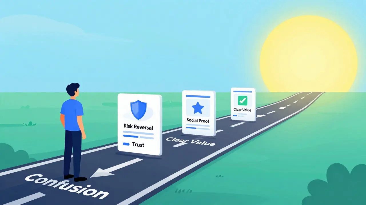
The biggest barrier to purchase is risk. What if the course is bad? What if it doesn't work for them? Offer a money-back guarantee. A 30-day refund policy signals confidence in your product. Make the terms clear and simple. "Try it risk-free for 30 days. If you're not satisfied, get a full refund." This reduces hesitation significantly.
7. Final Call-to-Action: Close the Deal
End with a strong final push. Remind them of the transformation they will achieve. Repeat the price if it is competitive, or highlight the value compared to alternatives. Use urgency ethically: "Enrollment closes soon" or "Limited spots available." Ensure the CTA button is large, contrasting in color, and easy to tap on mobile.
Optimizing for Mobile: Non-Negotiable in 2026
In 2026, ignoring mobile optimization is business suicide. More than half of your potential students will view your sales page on a smartphone. If your site is slow, text is too small, or buttons are hard to tap, they will bounce immediately. Google's Core Web Vitals prioritize user experience, so a poorly optimized mobile site hurts your SEO rankings too.
Test your page on multiple devices. Check load times-aim for under two seconds. Compress images without losing quality. Use responsive design so layouts adjust automatically to screen size. Ensure form fields are large enough for thumbs. Every extra second of load time can drop conversions by 7%. Speed is not just a technical detail; it is a revenue driver.
A/B Testing: The Engine of Continuous Improvement
You will never know what works best until you test it. Guessing based on opinions leads to mediocre results. A/B testing involves creating two versions of your sales page and showing them to different segments of your audience. You change one element at a time-headlines, images, button colors, or pricing placement-and measure which version converts better.
Start with high-impact elements. Test your headline first, as it determines whether visitors stay or leave. Then test your CTA button text. Finally, test social proof placement. Run tests for at least two weeks to gather statistically significant data. Tools like Google Optimize or dedicated CRO platforms can automate this process. Remember, optimization is not a one-time task; it is an ongoing cycle of hypothesis, testing, and learning.
| Element to Test | Version A (Control) | Version B (Variant) | Expected Impact |
|---|---|---|---|
| Headline | Benefit-focused | Curiosity-driven | High |
| CTA Button Color | Blue | Orange | Medium |
| Price Display | $199 | Only $199/month | High |
| Testimonial Format | Text quotes | Video clips | Medium |
| Guarantee Placement | Bottom of page | Near CTA button | High |
Reducing Friction in the Checkout Process
Even if your sales page is perfect, a clunky checkout will kill conversions. The fewer steps between decision and payment, the better. Ask for only essential information. Name and email are usually enough; do not request phone numbers or addresses unless necessary for physical goods. Offer multiple payment options, including credit cards, PayPal, and local methods relevant to your audience. One-click purchasing or saved payment details for returning customers can boost repeat sales.
Display security badges near the payment button to reassure users their data is safe. SSL certificates are standard, but explicit trust symbols like Norton Secured or McAfee Secure add psychological comfort. If you offer installment plans, make that option clear early in the process. Breaking a $500 course into five $100 payments can double conversion rates for price-sensitive buyers.
Leveraging Email Marketing for Abandoned Carts
Not everyone will buy on the first visit. That is normal. Capture emails with a lead magnet-a free chapter, a mini-course, or a checklist related to your main offering. Then, set up an automated email sequence for those who abandon their cart. Send a gentle reminder after 24 hours, highlighting the benefits again. Follow up with a testimonial or a limited-time discount after 48 hours. Personalize the emails using the recipient's name and referencing the specific course they viewed. This retargeting strategy can recover 10-15% of lost sales.
Measuring Success: Key Metrics to Track
To optimize effectively, you must measure accurately. Focus on these key performance indicators (KPIs):
- Conversion Rate: Percentage of visitors who enroll. Industry average for courses is 2-5%; aim higher.
- Bounce Rate: Percentage of visitors who leave immediately. High bounce rates indicate irrelevant traffic or poor page design.
- Average Order Value (AOV): Revenue per transaction. Upsells and bundles can increase this.
- Customer Acquisition Cost (CAC): How much you spend on ads to get one student. Keep CAC lower than lifetime value (LTV).
- Time on Page: Indicates engagement. Longer times suggest interest, but not necessarily intent to buy.
Use analytics tools like Google Analytics or Mixpanel to track these metrics. Set up goals for each step of the funnel, from landing page view to completed purchase. Identify drop-off points and investigate why users leave. Heatmaps can show where users click and scroll, revealing hidden usability issues.
Common Mistakes to Avoid
Many course creators sabotage their own sales with avoidable errors. Loading too many plugins slows down your site. Using jargon alienates beginners. Hiding the price creates suspicion. Ignoring mobile users loses half your market. Failing to update content makes your course seem outdated. Regularly audit your sales page for broken links, outdated testimonials, or unclear instructions. Freshness matters; students want to know the material is current.
Another mistake is overcomplicating the offer. Too many upsells, bonuses, and tiers confuse buyers. Simplify. One clear path to purchase is better than three confusing options. Clarity beats cleverness every time.
Next Steps for Your Course Business
Start by auditing your current sales page against the structure outlined above. Identify weak points and prioritize fixes based on potential impact. Implement A/B testing for your headline and CTA. Monitor mobile performance closely. Engage with your existing students to gather fresh testimonials. Optimization is iterative; small changes compound over time. By focusing on user experience, clarity, and trust, you will turn casual visitors into loyal students.
What is a good conversion rate for a course sales page?
A good conversion rate typically ranges from 2% to 5%. However, this varies by niche, traffic source, and price point. High-ticket courses may convert at lower rates due to higher consideration, while low-cost impulse buys can exceed 10%. Benchmark against your industry averages and focus on continuous improvement rather than hitting a fixed number.
How long should my course sales page be?
There is no fixed length, but longer pages often convert better for complex or expensive courses because they provide more information and build trust. Aim for comprehensive coverage of benefits, curriculum, and social proof. Use white space, headings, and visuals to keep it readable. Shorter pages work for simple, low-cost offers where the decision is quick.
Should I include a video on my sales page?
Yes, video is highly effective. A short introductory video (1-3 minutes) where you explain the course and its benefits can significantly boost engagement and trust. Place it near the top, below the headline. Ensure it has captions for accessibility and silent viewing. Video demonstrates your personality and teaching style, helping students connect with you before buying.
How often should I update my sales page?
Review and update your sales page quarterly or whenever you make significant changes to the course content. Add new testimonials, refresh statistics, and ensure all links work. Seasonal promotions or new module launches are good triggers for updates. Keeping the page fresh shows active maintenance and relevance, which builds buyer confidence.
What is the best way to handle objections on a sales page?
Address objections proactively in a dedicated FAQ section or within the copy itself. Common objections include price, time commitment, and prior knowledge requirements. Explain the ROI, emphasize flexibility, and clarify prerequisites. Use social proof to counter doubts about effectiveness. Being transparent about limitations builds more trust than hiding them.
Do I need a money-back guarantee?
While not legally required, a money-back guarantee is a powerful conversion tool. It reduces perceived risk for buyers. A 14-30 day window is standard. Clearly state the terms to avoid abuse. Most students won't refund, but the presence of the guarantee removes the final barrier to purchase for hesitant prospects.
How does page speed affect conversions?
Page speed directly impacts conversions. Studies show that a 1-second delay in load time can reduce conversions by 7%. Slow pages frustrate users, increase bounce rates, and hurt SEO rankings. Optimize images, minify code, and use a reliable hosting provider. Aim for a load time under 2 seconds for the best user experience and maximum sales potential.
