When you take an online course, you expect it to feel like it was made by one person - not stitched together by five different editors over three months. That’s the power of a solid course style guide. It’s not just about fonts and colors. It’s about making every video, quiz, and handout feel like part of the same conversation. Without it, your learners get whiplash. One module sounds like a college lecture. The next feels like a TikTok script. That’s not just confusing - it’s demotivating.
Why Your Course Needs a Style Guide
Imagine walking into a store where the shelves are labeled in three different languages, the lighting changes every aisle, and the staff wear mismatched uniforms. You’d leave. Online learners do the same. A style guide keeps your course from becoming a chaotic mess. It answers questions like: Do we use contractions? Are we casual or formal? Should we use icons or photos? What font size works on mobile?
Without a guide, you’re leaving decisions to chance. A new instructor adds a module. They use a different voice. A designer picks a new color palette. A copywriter writes quiz questions in passive voice. Before you know it, your course has no identity. Learners start asking, ‘Who even made this?’
Companies like Coursera and LinkedIn Learning use style guides because consistency builds trust. When learners know what to expect, they focus on learning - not guessing.
Defining Your Course Voice
Voice is your course’s personality. It’s how your content sounds when read aloud. Is it friendly? Authoritative? Playful? Dry? Your voice doesn’t change based on the topic - it stays the same whether you’re teaching Excel formulas or leadership skills.
Ask yourself: Who are you talking to? A 25-year-old marketing intern? A 50-year-old small business owner? A high school student? Their expectations shape your voice. If you’re teaching beginners, avoid jargon. If you’re teaching professionals, don’t talk down to them.
Here’s a real example: A course on budgeting for freelancers uses a voice like a trusted friend who’s been there. Sentences are short. Phrases like ‘you’re not alone’ and ‘I’ve been there too’ show up often. It doesn’t sound like a textbook. It sounds like someone who gets it.
Write down three words that describe your voice. Maybe they’re: clear, encouraging, direct. Keep them printed where your team can see them. Every time someone writes new content, they ask: ‘Does this sound like us?’
Tone: Adapting to the Moment
Tone is different from voice. Voice is your constant. Tone shifts with context. A joke in an intro video is fine. A joke in a quiz about tax law? Not so much.
Use tone to match the emotional weight of the content:
- Introduction videos: warm, inviting, upbeat
- Complex explanations: calm, patient, structured
- Assessments: neutral, clear, no fluff
- Feedback messages: supportive, specific, kind
- Closing module: celebratory, motivating
One course creator I know had learners say, ‘I felt like I failed’ after a quiz. Turns out, the feedback said: ‘Incorrect. Try again.’ No encouragement. No hint. Just a dead end. They changed it to: ‘Almost there! Here’s a tip to help you nail this next time.’ Engagement jumped 37%.
Build a tone chart. List the content type on one side. On the other, write the tone you want. Share it with everyone who writes or edits content for your course.

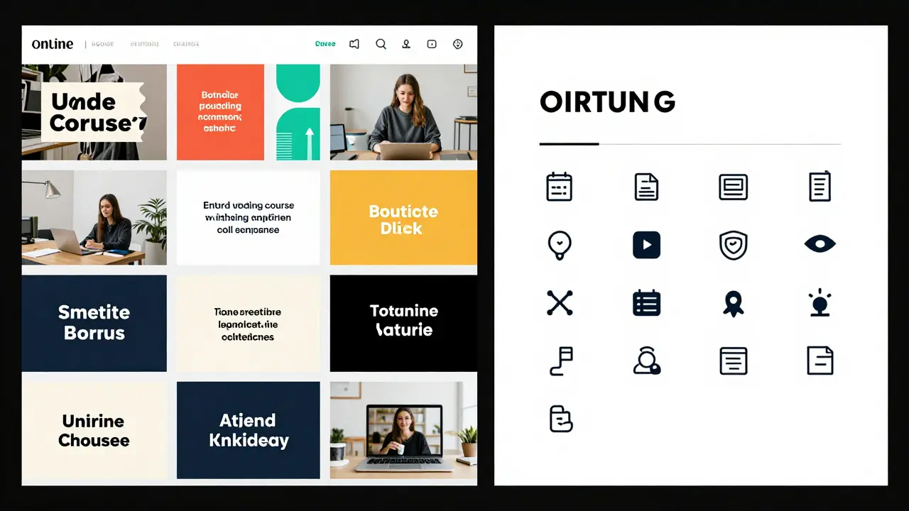
Visual Standards: More Than Just Colors
Visual consistency is just as important as wording. If your thumbnails look like they’re from 2018, your course feels outdated - even if the content is cutting-edge.
Here’s what to lock down:
- Fonts: One font for headings, one for body text. No more. Example: Inter for headings, Lato for body.
- Colors: Primary, secondary, and accent palette. Don’t use more than five. Define exact hex codes.
- Images: Style? Real photos or illustrations? Bright and airy or moody and professional? Use the same filter or editing preset across all visuals.
- Icons: Use one icon set. Line icons? Filled? Flat? Don’t mix styles.
- Video style: Lighting? Background? Camera angle? If you use a green screen, use it every time. If you film on a desk, keep the desk the same.
- Animations: Do you use slide transitions? If so, keep them simple and consistent. No bouncing text.
One course I reviewed had 12 different font sizes in the PDF handouts. Some text was 10pt, some 14pt, some bold, some italic - no pattern. Learners said it felt ‘unprofessional.’ Fixing it took two days. The result? 42% fewer support emails about formatting issues.
Putting It All Together: The Style Guide Template
Here’s a simple structure that works for most courses:
- Course Overview: One paragraph describing the course’s goal and audience.
- Voice: Three adjectives. Examples. What to avoid.
- Tone Guide: Table matching content type to tone (as above).
- Visual Standards: Font names, color codes, image style, icon set, video specs.
- Writing Rules: Do we use Oxford commas? Spell out numbers under 10? Use ‘you’ or ‘the learner’?
- Accessibility Notes: Alt text style, caption format, contrast ratios.
- Examples: One good and one bad example for each section.
Keep this document in your course folder. Make it editable - but only one person updates it. Everyone else follows.
Common Mistakes to Avoid
Even teams with good intentions mess this up. Here’s what goes wrong:
- Changing voice for ‘variety’: ‘Let’s make Module 3 fun!’ → Now it’s a meme. Stay on brand.
- Using stock photos that don’t match: A photo of a smiling woman in a suit doesn’t work if your course is about single parents working from home.
- Letting designers pick colors: They pick trendy palettes. Your learners don’t care about trends. They care about readability.
- Ignoring mobile: If your font is too small on phone screens, half your audience won’t read it.
- Not training your team: If your editor doesn’t know your voice, they’ll ‘clean up’ your tone and kill your personality.
One course had 17 contributors. No style guide. The final product had six different fonts, three color schemes, and four writing styles. Learners gave it a 2.8/5 rating. ‘Feels like a collage,’ one wrote. They rebuilt it with a guide. Rating jumped to 4.6.
How to Get Buy-In
Getting your team to follow a style guide is harder than writing it. Here’s how to make it stick:
- Make it visual. Use screenshots. Show side-by-side comparisons.
- Start small. Pick one section - say, video intros - and fix that first.
- Use it in onboarding. New team members get the guide on Day 1.
- Link it to your LMS. Embed it in your course editor so it’s always visible.
- Review it quarterly. Does it still fit? Has the audience changed?
Don’t treat it like a rulebook. Treat it like your course’s DNA. It’s not about control. It’s about clarity.
When You Don’t Have Time
You’re solo. You’re rushing. You don’t have a team. You still need consistency.
Start with three rules:
- Always use the same font for headings.
- Always write in second person (‘you’).
- Always end videos with the same sign-off: ‘See you in the next module.’
That’s it. Three things. Do them every time. You’ll be ahead of 90% of solo creators.
Final Thought: Consistency Builds Confidence
People don’t remember your course because it was flashy. They remember it because it felt reliable. They knew what to expect. They trusted the rhythm. They didn’t have to think about the design - they just learned.
A style guide isn’t about being boring. It’s about being clear. It’s about removing friction so your learners can focus on what matters: learning.
Start small. Write it down. Stick to it. Your learners will thank you - even if they never say it out loud.
Do I need a style guide if I’m the only one creating the course?
Yes. Even solo creators benefit from a style guide. It prevents you from changing your mind halfway through. If you use a different tone in Module 4 than in Module 1, learners notice - even if you don’t. A simple 1-page guide with your voice, tone rules, and visual preferences keeps your course feeling unified.
Can I reuse a style guide from another course?
You can borrow structure, but not content. A style guide for a finance course won’t work for a yoga class. Voice and tone must match the audience and subject. Use another guide as inspiration, but rewrite it for your specific learners. The structure - voice, tone, visuals - stays. The details change.
How often should I update my course style guide?
Review it every 6 to 12 months. If your audience changes - say, you’re now teaching professionals instead of students - your voice and visuals might need updating. Also update it if you notice learners are confused by your design choices or if you add new content types like live Q&As or interactive simulations.
What’s the most overlooked part of a course style guide?
Accessibility. Many creators focus on looks and voice but forget how their course works for people with visual or hearing impairments. Always include alt text guidelines, caption formatting rules, and contrast ratio checks. A course that looks great but isn’t usable by everyone isn’t truly well-designed.
Should I include examples of good and bad content in the guide?
Absolutely. People remember stories and visuals better than rules. Show a before-and-after: a confusing sentence vs. your revised version. A messy slide vs. your clean template. This cuts down on questions and edits because your team can see exactly what you mean.

Comments (14)
Sandeepan Gupta January 23 2026
A style guide isn't just a document-it's the backbone of learner trust. I've seen courses fall apart because no one agreed on whether to use 'you' or 'the learner.' Consistency isn't boring. It's professional. Start with voice, then build outward. Don't wait until Module 7 to realize you sound like two different people.
Tarun nahata January 23 2026
THIS. I was just telling my team yesterday-your course shouldn’t feel like a garage sale of ideas. One module’s a TED Talk, the next’s a DM from your cousin. I turned our guide into a poster on the wall. Now when someone writes ‘lol’ in a compliance module, someone else points to it and says ‘remember the voice.’ Game changer.
Aryan Jain January 25 2026
They don’t want you to have a style guide. They want you to be controlled. Who decides what ‘professional’ looks like? Corporations. Big EdTech. They strip the soul out of teaching just to make it ‘consistent.’ You think learners care about hex codes? No. They care about connection. This guide is just corporate control dressed up as ‘clarity.’
Pooja Kalra January 26 2026
Interesting. But I wonder-how many creators actually follow these guidelines? Or is this just another theoretical framework that collects dust in a shared drive? I’ve seen guides like this-beautifully written, never referenced. The real challenge isn’t writing it. It’s making it sacred.
Jen Deschambeault January 28 2026
Love the tone chart. I used to think tone was just ‘being nice.’ Turns out, it’s emotional engineering. We changed feedback from ‘Wrong’ to ‘You’re so close-here’s a nudge’ and completion rates jumped. Small shifts, huge impact. This isn’t fluff. It’s psychology.
Kayla Ellsworth January 29 2026
Wow. A 12-page manifesto on how to be boring. Next they’ll tell us to use the same font for death notices. Who decided ‘no bouncing text’ was a universal truth? Maybe some learners like chaos. Maybe they’re tired of corporate-sanitized learning. Maybe the real problem is that we assume everyone learns the same way.
Soham Dhruv January 30 2026
bro this is spot on. i used to think style guides were for big companies but then i made a mini course on fixing leaky faucets and i kept switching between ‘you’ and ‘the homeowner’ and it felt weird. now i just use ‘you’ every time, same font, same signoff. learners said it felt like i was talking to them. no fancy tools. just three rules.
Bob Buthune February 1 2026
I’ve been in this field for 18 years and I’ve seen it all. I remember one course where the intro video had jazz music, the quiz had a robotic voice, and the PDF was printed in Comic Sans. Learners cried. Not because they failed. Because they felt abandoned. This guide? It’s not about aesthetics. It’s about not leaving people alone in the dark. When you ignore consistency, you’re not just being sloppy-you’re emotionally negligent.
Jane San Miguel February 2 2026
While the intent behind this guide is commendable, its execution reveals a fundamental misunderstanding of pedagogical diversity. The prescriptive nature of font pairings, color palettes, and rigid tone mappings implicitly assumes a monolithic learner profile-an epistemological fallacy. Furthermore, the dismissal of stylistic variation as ‘chaos’ ignores the cognitive benefits of contextual modulation in instructional design. One must question whether homogenization truly serves adult learning theory.
Kasey Drymalla February 3 2026
This is how they brainwash you. First they make you use the same font. Then they make you say ‘you’ instead of ‘the learner.’ Next thing you know, you’re not allowed to joke in a module about taxes. They’re turning education into a corporate ad. Who owns this guide? Who profits? It’s not about learning. It’s about control. And they want you to think it’s helpful.
Dave Sumner Smith February 4 2026
You think this is about learners? No. This is about HR departments covering their asses. If a learner complains, they point to the guide and say ‘we followed protocol.’ The guide doesn’t help students. It protects managers. And the ‘accessibility’ section? That’s just to check a box so they can get government grants. Real accessibility means letting people learn how they want-not forcing them into your font and color prison.
Cait Sporleder February 5 2026
While the structural framework proposed herein is undeniably systematic and laudable in its intentionality, one must interrogate the underlying epistemological assumptions embedded within its axiomatic structure. The conflation of visual homogeneity with pedagogical efficacy presupposes a positivist model of knowledge transmission-an approach increasingly contested by constructivist and sociocultural learning theorists. Furthermore, the prescriptive nature of tone mapping, while operationally convenient, risks infantilizing adult learners by foreclosing interpretive agency. A more nuanced approach might embrace dialectical variation as a pedagogical asset rather than a deviation to be corrected.
Paul Timms February 7 2026
Simple, clear, and dead-on. I’ve been on teams where no one followed a guide. It was a mess. We made this one page, printed it, and hung it up. Now everyone knows what ‘our voice’ means. No debates. No confusion. Just better learning. Do it.
Nathaniel Petrovick February 7 2026
the three rule thing at the end? that’s the gold. i was overcomplicating it with a 20 page doc. now i just use the same font, say ‘you’, and end with ‘see you next module’. my course feels way more human. no one’s gonna notice the font but they’ll feel the rhythm. that’s what matters.