When you run a business course - whether it’s an online MBA, a weekend workshop, or a corporate training program - you’re not just teaching. You’re running a product. And like any product, it needs to be measured, tested, and improved. Too many course creators rely on gut feelings: "It went well," or "Students seemed engaged." But if you don’t track what’s actually happening, you’re flying blind. The difference between a course that fades away and one that grows? Data.
What KPIs Actually Matter for Business Courses
Not all numbers are created equal. You don’t need to track every click. You need the ones that tell you if your course is working. Here are the three KPIs that actually move the needle:
- Completion rate: What percentage of enrolled students finish the course? If it’s below 40%, something’s off. Maybe the content is too long, the pacing is off, or the first module doesn’t hook them.
- Engagement depth: How many videos do they watch? How many quizzes do they attempt? How often do they return? A student who watches 80% of videos and submits all assignments is far more likely to recommend your course than one who logs in once.
- Outcome satisfaction: Ask them. Not with a 5-star rating. Ask: "What’s one thing you’ve applied in your job since taking this course?" Real-world application is the gold standard. If students can’t name one useful takeaway, your course isn’t delivering value.
These aren’t vanity metrics. They’re survival metrics. A course with 70% completion and 90% outcome satisfaction will grow through word-of-mouth. One with 20% completion and 30% satisfaction? It’ll die quietly.
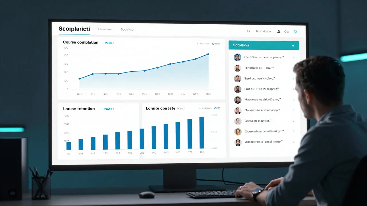
Building Dashboards That Actually Get Used
Dashboards aren’t for showing off. They’re for making decisions. A good course dashboard tells you three things in under 10 seconds:
- Where are students dropping off?
- Who’s excelling - and who’s falling behind?
- What’s the trend over time? Are results getting better or worse?
Most dashboards fail because they show too much. A wall of charts doesn’t help - it paralyzes. Here’s what a working dashboard looks like:
- A single line graph showing weekly completion rates over the last 12 months.
- A bar chart comparing quiz scores by module - highlighting the one with the lowest pass rate.
- A list of the top 5 student comments from feedback forms, updated weekly.
At a course I helped redesign last year, we cut the dashboard from 14 charts to 3. Within two months, instructors started checking it daily. Why? Because they could act on it. One module had a 65% failure rate. We rewrote it. Within a month, pass rates jumped to 89%.
Don’t build dashboards for your team. Build them for the person who needs to fix something.

Running Experiments Like a Startup
Business courses don’t have to be static. You can test changes the same way a tech startup tests a new feature. Here’s how:
Let’s say you notice students aren’t finishing the leadership module. Instead of guessing why, run a small experiment:
- Version A: Original 45-minute video lecture.
- Version B: Three 10-minute videos with interactive reflection prompts after each.
Roll out Version B to 20% of new students. Keep Version A for the rest. Track completion, quiz scores, and feedback. After two weeks, you’ll know which version works better - no opinion, no guesswork.
Another experiment: Change the timing of feedback. Some courses send automated feedback right after a quiz. Others wait 48 hours. We tested both. Waiting 48 hours increased revision rates by 37%. Why? Students had time to think. They didn’t just click "submit" and move on.
Experiments don’t require a big budget. They require curiosity. One course creator I know tested sending a short voice note to students who hadn’t logged in for 3 days. Response rate jumped from 8% to 41%. It cost her 20 minutes a week.
Connecting the Dots: KPIs, Dashboards, and Experiments Together
KPIs tell you what’s happening. Dashboards show you where to look. Experiments let you fix it.
Think of it like a car. KPIs are the dashboard lights - engine temperature, fuel level, tire pressure. The dashboard is the actual gauge panel. Experiments are the mechanic’s toolkit.
Here’s how they work together in practice:
- You notice completion rates are dropping. (KPI)
- You check your dashboard and see the drop happens right after Module 3. (Dashboard)
- You run an A/B test: swap Module 3’s content for a shorter, case-study version. (Experiment)
- Completion rates rise by 22%. You roll it out to everyone. (Action)
This loop - measure, observe, test, act - turns your course from a static product into a living system. It adapts. It improves. It grows.

Common Mistakes to Avoid
Even with data, people mess up. Here are the three most common mistakes:
- Measuring activity instead of impact: Track how many logged in? That’s easy. Track how many changed their behavior? That’s hard - but it’s the only number that matters.
- Ignoring qualitative data: Numbers tell you what happened. Open-ended feedback tells you why. One student saying, "I didn’t understand how to apply this to my team," is worth 1000 quiz scores.
- Waiting too long to act: If you wait three months to fix a module because "we’ll review it next quarter," you’ve already lost hundreds of students. Fix it in two weeks. Test it. Move on.
There’s no magic tool. No secret software. Just discipline. Check the numbers. Ask why. Test one thing. Repeat.
Where to Start Today
You don’t need to overhaul everything. Start with one module. Pick one KPI. Set up a simple dashboard. Run one experiment.
Here’s your 7-day plan:
- Day 1: Identify the module with the lowest completion rate.
- Day 2: Pull the data - how many started it? How many finished? What was the average quiz score?
- Day 3: Add one chart to your dashboard showing just that module’s completion trend over time.
- Day 4: Send a short survey: "What was the hardest part of this module?" (One question, 30 seconds max.)
- Day 5: Pick one change based on the data - shorten it? Add an example? Change the order?
- Day 6: Roll out the change to 10% of new students.
- Day 7: Compare results. Did it help? If yes, roll it out. If not, try something else.
You don’t need to be an analyst. You just need to care enough to look.

Comments (14)
ujjwal fouzdar February 18 2026
This is the kind of post that makes me believe in the possibility of human evolution. We’ve been teaching for centuries like priests chanting ancient scriptures, but here’s the truth: education is a living organism. It breathes, it bleeds, it adapts. And if you’re not measuring its pulse, you’re burying it alive. I’ve seen courses die in silence - no fanfare, no obituary. Just empty login screens and forgotten email threads. Data isn’t cold. It’s the heartbeat we refused to listen to.Anand Pandit February 18 2026
Love this breakdown. I’ve been using exactly this approach with our leadership program and the results have been game-changing. Completion rates jumped from 38% to 76% after we shortened Module 3 and added those reflection prompts. The dashboard we built? Just three charts - completion trend, quiz bottleneck, and top 5 feedback quotes. Instructors now check it before coffee. Simple. Actionable. Human.Reshma Jose February 19 2026
I used to think dashboards were for nerds. Then I saw one that just showed a line graph of weekly completions. That’s it. One line. I could tell at a glance if we were sinking or soaring. We stopped having meetings about ‘engagement’. Now we just look at the graph and fix what’s broken. No jargon. No slides. Just truth. And it’s beautiful.rahul shrimali February 20 2026
KPIs matter experiments work stop overthinking start doingEka Prabha February 21 2026
This entire framework is a corporate illusion wrapped in analytics jargon. You think measuring completion rates changes human behavior? It doesn’t. It just gives managers a false sense of control. Real learning happens in the shadows - in late-night WhatsApp groups, in coffee shop rants, in the silence between modules. The moment you turn education into a KPI factory, you kill its soul. And yes, I’ve worked for three edtech firms. I know what they’re hiding.Bharat Patel February 21 2026
There’s a quiet philosophy here that I think gets lost. We treat courses like products, but what if they’re more like relationships? You don’t measure love by how often someone logs in. You measure it by whether they show up when it’s hard. That one question - "What’s one thing you’ve applied?" - that’s the altar where true learning is offered. Not the dashboard. Not the completion rate. The moment someone changes their life because of your course. That’s the metric that matters.Bhagyashri Zokarkar February 22 2026
i just dont get why we have to make everything so complicated like i mean sure track stuff but like what if people just wanna learn without being monitored like its not a game where u get badges for watching videos its a course its not supposed to feel like a prison system i just want to finish and feel smarter not like im being tracked like a crypto miner or somethingRakesh Dorwal February 23 2026
India has been producing world-class educators for decades. Why are we copying Western corporate models? Our ancient gurukul system didn’t have dashboards. It had presence. It had silence. It had disciples sitting at the feet of their teacher. Data doesn’t teach. Presence teaches. Maybe instead of A/B testing modules, we should bring back the art of listening. The West is drowning in metrics. We have the wisdom to rise above it.Vishal Gaur February 24 2026
i agree with the general idea but honestly most of these courses are run by people who cant even spell kpi right let alone build a dashboard. i saw a course last year where the instructor had a google sheet with 17 tabs and no one knew what half of them meant. and the feedback form? it asked "how satisfied are you on a scale of 1-10" and then "why?" - but the why box was only 20 characters. so people wrote "good". and they called that data. we’re not fixing education. we’re just automating the nonsense.Nikhil Gavhane February 25 2026
I’ve been on the other side of this - the student who dropped out after Module 2. I didn’t quit because the content was bad. I quit because I felt invisible. No one noticed I was gone. No one reached out. No dashboard told the teacher I existed. This post reminds me that behind every completion rate is a real person wondering if they belong. The real KPI isn’t how many finish - it’s how many feel seen.Rajat Patil February 25 2026
I appreciate the clarity of this approach. It is both thoughtful and practical. In my experience, the most effective course improvements occur not from grand overhauls, but from small, consistent acts of attention. One question. One chart. One experiment. The cumulative effect is profound. Education, at its core, is not about systems. It is about care. And care, when consistently applied, transforms.deepak srinivasa February 25 2026
What if the real KPI isn’t completion or application, but curiosity? What if a student doesn’t finish the course but spends three nights researching one concept because it sparked something? Do we track that? Should we? Maybe the goal isn’t to measure outcomes, but to ignite questions that outlive the course. I’m not sure dashboards can capture that. But maybe that’s okay.pk Pk February 26 2026
This is the blueprint every course creator needs. I’ve mentored 120+ instructors. The ones who thrive? They don’t care about enrollment numbers. They care about one student who sent them a voice note saying, ‘I used your framework to quit my toxic job.’ That’s the win. Start small. Pick one module. Ask one question. Fix one thing. Then do it again. Growth isn’t a sprint. It’s a thousand tiny acts of courage.Shivani Vaidya February 28 2026
While the empirical framework presented is undeniably pragmatic, one must not overlook the ontological dimensions of pedagogical engagement. The quantification of learning - while operationally efficacious - risks reifying education into a transactional paradigm, thereby eroding the phenomenological richness of the learner’s interior experience. One might posit that the most significant outcomes - epistemic transformation, moral clarification, existential resonance - remain inherently resistant to metricization. Hence, while the dashboard serves as a necessary instrument, it must not become the sole epistemology of educational efficacy.