You spend hours recording your lessons. You prep the slides, you rehearse the script, and you hit record with confidence. But when you watch back the footage, something feels... off. The lighting is flat, the colors look washed out, or worse, they look like a home video from 2010. Your content is gold, but the packaging looks cheap.
This is where color grading and professional editing save your course. In the world of online education, visual quality isn't just about looking pretty; it’s about retention. If a student’s eyes are tired from fighting glare or confusing color shifts, they click away. If they stay engaged, they learn. And if they learn, they recommend your course.
For course creators in 2026, you don’t need a Hollywood budget to fix this. You need a workflow. This guide breaks down how to take raw footage and turn it into polished, professional training material using tools you likely already own.
The Difference Between Correction and Grading
Most beginners mix these two up. They think "grading" means making things look cool with teal and orange filters. It doesn't. Not at first.
Color correction is technical. Its job is to make sure every clip looks consistent. If you recorded Lesson 1 on a sunny Tuesday and Lesson 2 on a cloudy Wednesday, the exposure will be different. Correction brings them to the same baseline. White balance must be accurate so skin tones look natural, not blue or yellow. Exposure needs to be balanced so faces aren't silhouettes against bright windows.
Color grading is creative. It happens after correction. This is where you add style. For corporate training, you might want clean, neutral tones that feel trustworthy. For a creative arts course, you might push saturation slightly to make the visuals pop. The rule of thumb? Correct first, grade second. Never try to fix bad white balance with creative filters. It always looks muddy.
Setting Up Your Workspace for Efficiency
Editing course videos is different from editing YouTube vlogs. You have more footage, but less variety. A typical course module has talking-head segments, screen recordings, and slide overlays. Your workspace needs to handle this mix without slowing you down.
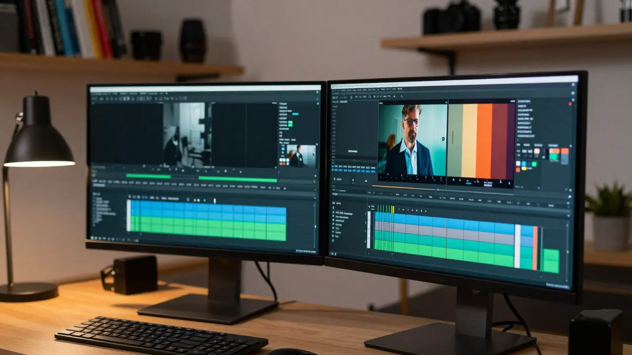
Start with your software. You don't need DaVinci Resolve Studio (the paid version) unless you are doing heavy VFX. The free version of DaVinci Resolve is a powerful node-based color grading tool used by professionals worldwide handles 95% of course creator needs. Adobe Premiere Pro is also standard, especially if you use After Effects for motion graphics. Final Cut Pro remains the king for Mac users due to its speed and magnetic timeline.
Here is a pro tip for organization: Create bins (folders) in your project for each lesson. Inside each bin, create sub-folders for "Raw Footage," "Audio," "Graphics," and "Exports." When you are grading Lesson 4, you shouldn't be scrolling through 500 clips from Lesson 1. Structure saves sanity.
Step-by-Step Color Workflow for Talking Heads
Talking heads are the backbone of most courses. Here is the exact sequence I use to ensure faces look natural and engaging.
- Scopes, Not Eyes: Don't trust your monitor alone. Open your waveform monitor and vectorscope. These tools show you exactly what brightness and color data is in the image. If your histogram shows a spike on the left, your shadows are crushed (too black). If it's all on the right, your highlights are blown out (too white).
- White Balance: Use the dropper tool on a neutral gray object in the frame. If you don't have one, pick a mid-tone area on the wall or shirt. Adjust until the red, green, and blue levels are equal.
- Exposure Adjustment: Lift the blacks slightly so they aren't pure black (unless it's a high-contrast artistic choice). Lower the whites so details in bright areas remain visible. Aim for a middle ground where the subject's face is well-lit but not glowing.
- Skin Tone Isolation: On the vectorscope, there is a line called the "skin tone line." All human skin tones, regardless of ethnicity, should fall near this line. If your subject's skin is falling far off this line, adjust the hue and saturation until it aligns. This prevents people from looking sickly or overly tan.
- Contrast and Clarity: Add a slight S-curve to the contrast. This makes the image pop. Increase clarity or texture subtly to bring out detail in hair and clothing, but don't overdo it, or it will look gritty.
Once you nail this look on one shot, save it as a preset or copy-paste the nodes/effects to the rest of the talking head shots in that lesson. Then, fine-tune individually if the lighting changed between takes.
Handling Screen Recordings and Slides
Screen recordings are tricky. They are often high-contrast with lots of white space and small text. If you apply the same grade as your talking head, the text might become unreadable or the white backgrounds might blow out.
Treat screen captures differently. Keep the contrast lower. Protect the highlights aggressively. If you are showing code or documents, accuracy matters more than aesthetics. Do not saturate screen recordings heavily; it distorts UI elements and makes reading difficult. Instead, focus on sharpness. A slight increase in sharpening can help small text appear crisper on mobile devices, which is where many students consume your content.
If you are overlaying slides, ensure the background color of your slides matches the aesthetic of your video. If your video has a warm, cozy grade, don't put cold, sterile blue slides on top. Visual harmony keeps the viewer immersed.
| Video Type | Primary Goal | Key Adjustment | Pitfall to Avoid |
|---|---|---|---|
| Talking Head | Natural Skin Tones | Vectorscope Alignment | Over-saturation |
| Screen Recording | Readability | Highlight Protection | Blown-out Whites |
| B-Roll/Cutaways | Visual Interest | Contrast Boost | Inconsistent Lighting |
Editing Rhythm and Pacing
Color draws the eye, but editing holds the attention. In course creation, pacing is critical. Students have short attention spans. Long pauses, "ums," and dead air kill momentum.
Use J-cuts and L-cuts. A J-cut is when the audio from the next scene starts before the video cuts to it. An L-cut is when the audio from the current scene continues over the next video clip. These techniques make transitions feel seamless and natural, rather than choppy. It mimics real conversation flow.
Remove the breaths and pauses. Not all of them-keep enough to sound human-but trim the excess. If you see yourself blinking for three seconds, cut it. If you pause for thought, tighten it. This increases the information density per minute, which students appreciate.
Add B-roll (supplementary footage) whenever you mention a concept visually. If you're talking about "market growth," show a graph or relevant stock footage. This dual-coding (visual + auditory) improves learning retention significantly. Just ensure the B-roll is color-graded to match your main footage. Nothing breaks immersion faster than a jarring shift in color temperature between clips.
Export Settings for Learning Management Systems
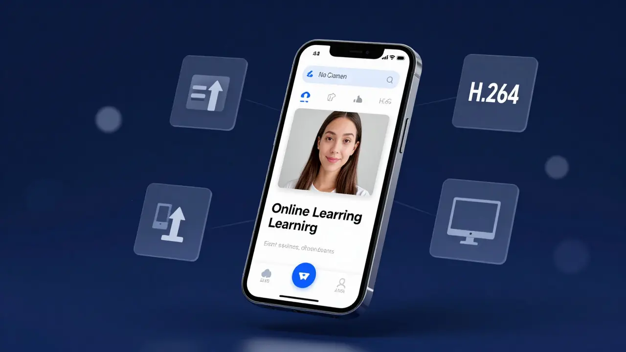
You've graded, edited, and polished. Now you need to upload. Many course creators ruin their work here by choosing wrong export settings. Platforms like Teachable, Thinkific, or Kajabi compress video automatically. If you upload a massive 4K file, their compressor crushes the quality. If you upload too low-res, it looks pixelated.
Aim for the sweet spot: 1080p (1920x1080) resolution. Codecs matter. Use H.264 for maximum compatibility. It works everywhere. H.265 (HEVC) is more efficient but can cause playback issues on older browsers or devices. Set your bitrate to around 10-15 Mbps for 1080p. This provides high quality without bloating the file size excessively.
Always render a test clip. Upload it to your platform and watch it on a phone, a tablet, and a desktop. Check for banding (visible stripes in gradients) or artifacting (blocky pixels). If it looks good on mobile, it will look great on desktop. Mobile is where the majority of casual learners watch.
Common Mistakes to Avoid
- Over-grading: Remember, this is educational content, not a music video. Subtle is better. If the student notices the color grade, you went too far.
- Inconsistent Look: Every lesson should feel like part of the same series. Save your grades as presets and reuse them.
- Igoring Audio: Bad audio kills courses faster than bad video. Fix audio levels before you worry about color. Use noise reduction plugins if needed.
- Watching on an Uncalibrated Monitor: Your laptop screen might be too bright or too blue. Try to view your edits on a second screen, a TV, or even a phone to get a realistic idea of how others will see it.
Tools and Resources
You don't need expensive gear. A decent webcam or mirrorless camera is enough. For software, stick to what you know. If you are comfortable with Premiere, master Lumetri Color. If you prefer Resolve, learn the node structure. Consistency in tool usage speeds up your workflow more than switching to the "best" software.
Consider using LUTs (Look-Up Tables) as a starting point, not a finish line. A LUT is a preset filter. Apply a subtle cinematic LUT, then dial it back to 50% intensity and adjust manually. This gives you a head start on consistency.
Do I need a calibrated monitor for color grading?
Ideally, yes. A calibrated monitor ensures the colors you see are accurate to what others will see. However, for course creators, a high-quality IPS panel laptop or external monitor is usually sufficient. Always check your final exports on multiple devices, including phones, to catch discrepancies.
What is the best codec for uploading course videos?
H.264 is the industry standard for web delivery. It offers the best balance of file size and quality across all browsers and devices. While H.265 is more efficient, H.264 ensures broader compatibility without playback errors for your students.
How do I fix inconsistent lighting between takes?
Use color correction tools to match exposure and white balance. Start by adjusting the gain and offset to match the brightness levels. Then, use the white balance dropper on a neutral area. Finally, manually tweak shadows and highlights to blend the clips seamlessly.
Can I use AI tools for color grading?
Yes, many modern editors like Premiere Pro and DaVinci Resolve offer AI-powered auto-color features. These are great for getting a baseline quickly. However, always review and refine the results manually, as AI can sometimes misinterpret skin tones or complex lighting scenarios.
Should I grade my screen recordings differently?
Absolutely. Screen recordings require higher readability. Avoid heavy contrast or saturation changes that might distort text or UI elements. Focus on keeping whites bright but not blown out, and ensure text remains crisp and legible.
